· 6 min read
The Negative as Score: Adams, Print Values, and the Logic of Dodging and Burning
How Ansel Adams treated the negative as a fixed score and the print as performance, holding back and burning in to realize a visualized tonal scale.
Written in by Simon Lehmann Editor
The conventional negative aims to record a full scale of grey, from textured shadow to delicate highlight. Bill Brandt (1904–1983) moved in the opposite direction. His earlier social reportage — The English at Home (1936), A Night in London (1938), shot on a Rolleiflex twin-lens reflex with its standard lens on 6x6 — described the world in a complete documentary greyscale. The nudes that occupied him from 1944 onward did the reverse: blacks with no shadow detail, highlights burned to bare paper white, and the middle tones compressed almost out of existence. Combined with an old wide-angle camera, this produced one of the most distinctive bodies of nude photography of the twentieth century.
“Hard paper” is precise, not impressionistic. A black-and-white enlarging paper has an ISO Range, ISO(R), defined under ISO 6846:1992 as the log-exposure range it needs to render its full tonal scale, written to two significant figures with the decimal removed — so ISO(R) 110 means a 1.10 log-exposure range, ISO(R) 40 means 0.40.
A normally developed negative carries a density range of roughly 1.05 to 1.10 log. On ILFORD Multigrade IV RC, grade 2 has an ISO Range of 110 — a 1.10 log fit, so that negative maps its shadows, midtones and highlights neatly across the paper’s scale. Print the same negative on grade 5, whose ISO Range is 40, and the paper now accepts only a 0.40 log range, about 1.3 stops of subject brightness versus roughly 3.6 stops at grade 2. Everything outside that narrow window is driven to paper-base white or to maximum black. That, numerically, is the greyscale collapsing: the midtones are not darkened, they are squeezed off the ends of the curve. (The newer Multigrade RC Deluxe runs grade 2 at ISO(R) 90 and grade 5 at 50, a slightly gentler spread.)
In Brandt’s own period there were no contrast filters to dial; you bought a fixed grade. Graded chlorobromide and bromide papers — Kodak Kodabromide, Ilford Ilfobrom, Agfa Brovira — were sold up to grade 5, “extra hard.” The modern equivalent is a grade 5 Multigrade filter, with the practical catch that filters 4 to 5 need roughly double the exposure of the 00 to 3.5 band, the deep-blue high-contrast filtration being slower.
Stark grades alone do not give the lacquered blacks of a Brandt print; the surface does. Ferrotyping is the practice of drying a glossy fibre-based (baryta) print in contact, emulsion-side-down, against a polished chromed plate or heated glazer. The gelatin sets to a mirror finish, which deepens the maximum black and raises apparent Dmax. It works only on glossy fibre paper — never on resin-coated or matte surfaces — and a deeper black widens the visible distance from black to white, intensifying the graphic effect the hard grade has already begun.
The hand did the rest. British Art Studies (Issue 16, June 2020, Bill Brandt: Photography and the Printed Page) documents that Brandt “habitually made extensive adjustments with a brush and media, or a pencil”: a graphite pencil to re-draw contours, a white pencil to pick out detail, a blade to scrape out blemishes, airbrushed pigment and brushed-on dyes. Crucially, he did not always work toward more contrast — sometimes he retouched to reduce it and emphasise pattern. The essay’s argument is that these prints were made to read on the printed page; the plates of Perspective of Nudes were reproduced by photogravure, so Brandt was judging the image as it would survive that compression, not as a pristine silver object.
The distortion in the nudes is a property of an old, ultra-wide lens. In 1944 Brandt bought a second-hand wooden Kodak wide-angle view camera — mahogany and brass — from a camera shop in Covent Garden, London. It had been built for police crime-scene work, so that an officer could record an entire room from one fixed position; Brandt called this his decisive breakthrough, and the nude series proper began with the arrival of peace in 1945. He said the camera let him “see like a mouse, a fish or a fly.”
Its lens was a Carl Zeiss Jena Protar of 85mm focal length, marked f/18, covering roughly 110 degrees on the plate — comparable in angle of view, though not in focal length, to about a 15mm lens on 35mm. The near-total depth of field the camera is famous for is not free: it comes from stopping the Protar down to around f/45. A very small aperture plus a very short focal length keeps everything from the foreground limb to the far wall acceptably sharp at once. Placed close to a body, that wide field then exaggerates whatever is nearest — a hand, a knee, a foot swells while the rest of the figure recedes steeply.
Brandt did not correct the lens; he composed with it. In the London interior nudes of 1945 to about 1953 — made in Belgravia, Kensington, Hampstead, Campden Hill — a foreground limb fills the frame as a vast smooth plane while the torso shrinks behind it in implausible perspective. In the later studies on the East Sussex and French coasts in the late 1950s, the wide lens flattens the body against pebbles and chalk so that flesh, stone and horizon read as a single field of interlocking shapes. The work spans roughly 1945 to 1960, and Brandt returned to the project with a Hasselblad Super Wide (SWC), whose Zeiss Biogon 38mm f/4.5 gave a comparably extreme angle on 6x6.
Perspective of Nudes gathered the series: The Bodley Head, London, 1961, ninety photographs, a preface by Lawrence Durrell and an introduction by Chapman Mortimer, the plates printed by photogravure in Switzerland. Read together, the method is consistent. The hard grade and ferrotyped black strip away the texture and gradation that would identify the form as a particular body; the wide-angle lens reorganises what is left into geometry. Tonal fidelity is spent deliberately, so the photograph can become a study of shape.
· 6 min read
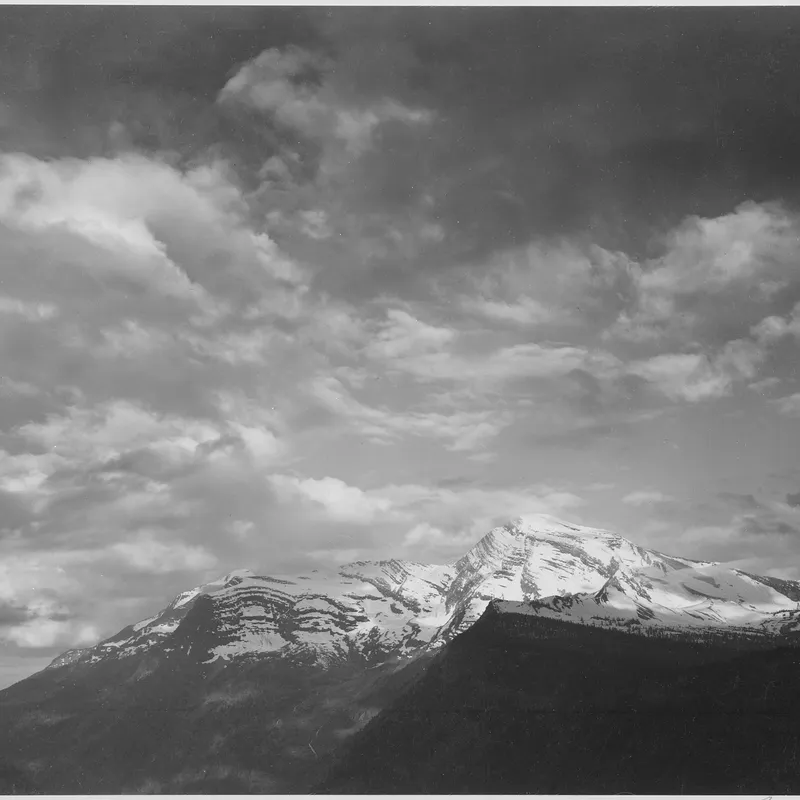
How Ansel Adams treated the negative as a fixed score and the print as performance, holding back and burning in to realize a visualized tonal scale.
· 8 min read
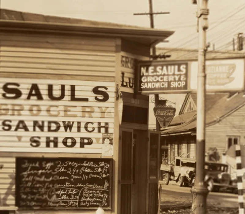
How Cartier-Bresson fused timing with internal geometry, composing the full 35mm frame in the viewfinder and printing uncropped, with the Leica as a discreet tool.
· 6 min read
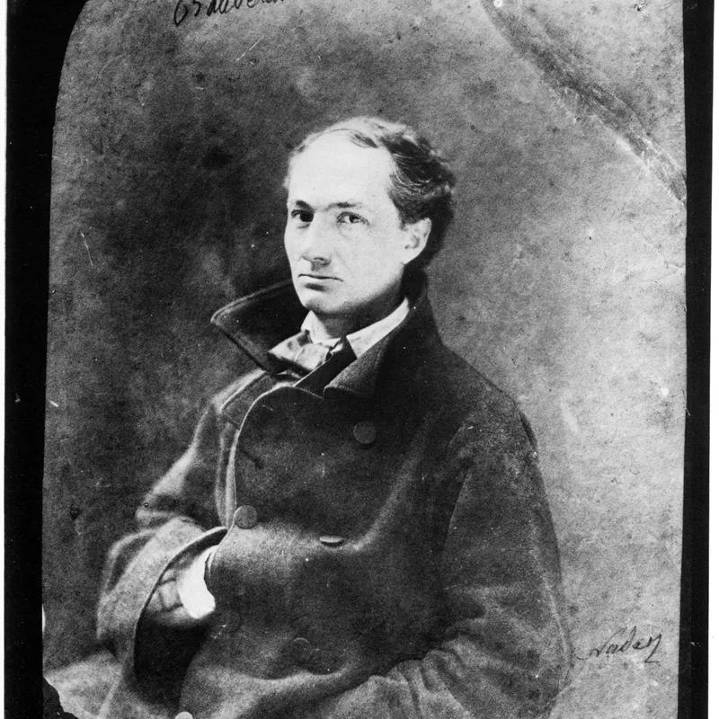
How a single hard light, deep shadow and minimal fill build Rembrandt and split lighting, and how the Zone System keeps the dark side readable.
The grainmag companion app
Meter and place your tones without a signal. No account, no internet required — just you, the light, and the grain.