· 6 min read
The Negative as Score: Adams, Print Values, and the Logic of Dodging and Burning
How Ansel Adams treated the negative as a fixed score and the print as performance, holding back and burning in to realize a visualized tonal scale.
Written in by Simon Lehmann Editor
By the mid-1910s the dominant style in art photography was pictorialism: soft focus, atmospheric printing, and surfaces handworked to resemble etching or charcoal. The photograph aspired to the condition of a painting. Paul Strand’s work between 1915 and 1922 marks the point at which black and white photography stopped imitating other media and began organising the world through its own properties: edge sharpness, controlled tonal separation, and the flat geometry of the frame. The shift was not merely stylistic. It changed what a photographer looked for before releasing the shutter, and it can be reconstructed today with a meter, a filter and a development chart.
Strand’s early prints followed pictorialist convention, but within a few years he abandoned manipulation entirely in favour of what came to be called straight photography: images made, in the language of the period, without tricks of process or handwork. Alfred Stieglitz devoted the final issue of Camera Work, the double number 49-50, dated June 1917, exclusively to Strand, in an edition limited to 500 copies. The eleven photogravures, among them Abstraction, Bowls (1916), Blind Woman (1916) and The White Fence (1916), were printed directly on the heavy journal stock rather than tipped in on Japanese tissue, producing a harder, less precious result that suited the pictures. Stieglitz wrote that they “represent the real Strand… The photographer who has added something to what has gone before.” The endorsement effectively closed the pictorialist era of the magazine and announced its successor.
The celebrated sharpness was not an in-camera effect alone. Through the 1920s Strand worked with 5x7 and 8x10 inch view cameras and made contact prints on platinum paper: the negative laid directly on the sheet and exposed at 1:1, with no enlargement and no diffusion between negative and print. Every detail the lens resolved on a sheet 8 inches wide arrived on the paper at full size, which is why the edges read as cut rather than drawn, and why the platinum process gave that long, delicate scale through the greys. The modern equivalent is direct: shoot large format and contact print, or enlarge a sharp negative with a good lens stopped to its optimum, around f/8 to f/11 on a 4x5 enlarger lens, and keep the negative carrier and easel flat. The point the post keeps returning to, sharpness as structure, begins as a printing decision, not a slogan.
Tonal contrast as structure also has a chemical history. The plates of Strand’s early period were orthochromatic, effectively blue-sensitive, because silver halide is naturally sensitive to blue and ultraviolet. Blue skies therefore overexposed to near-white and reds rendered dark or black. That is why the sky behind The White Fence and the voids of Wall Street (1915) sit where they do tonally: the emulsion, not only the framing, drove blue toward paper-white. Full panchromatic sensitivity, the response across the whole visible spectrum that Hermann Vogel’s dye-sensitising made possible and Wratten & Wainwright carried to market, only reached commercial still plates in 1906. Strand’s tonal geometry was built on what the film could and could not see.
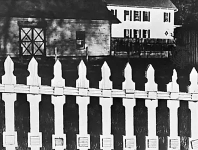
Take the white-fence problem to a modern bench with Ilford FP4 Plus, rated at ISO 125/22. Meter the shadowed building wall behind the fence and place it on Zone III; check where the sunlit pickets fall. If they read Zone VII to VIII you have a printable range and can develop normally, ID-11 stock 8.5 minutes at 20C, or ID-11 1+1 at 11 minutes for a gentler curve. If the pickets climb past Zone IX, the brightness range is too long, so contract development by roughly a stop: cut ID-11 stock from 8.5 to about 6.5 to 7 minutes. The logic is the Zone System maxim, expose for the shadows and develop for the highlights, because reduced development lowers highlight density while shadow density barely moves.
To lift the pickets clear of a blue sky, add a yellow filter, factor 2, costing 1 stop; an orange filter, factor 4, costs 2 stops and darkens the sky further; a red filter, factor roughly 4 to 5, about 2 to 2.3 stops, drives it toward black. With through-the-lens metering the factor is usually applied for you, though a deep red on some automatic cameras can still underexpose by up to 1.5 stops. Mind reciprocity at the long end: FP4 Plus needs no correction between 1/2 second and 1/10000 second, but past half a second the adjusted time is Ta = Tm^1.26.
The plane-based aesthetic the work argues for can be tuned in the developer. For the smoothest planes and finest grain, Perceptol stock at 12 minutes (20C, EI 125) suppresses texture so the shapes carry the picture. For maximum acutance, the crisp plane-against-plane edge, Ilfosol 3 at 1+9 for 4.25 minutes sharpens the boundaries. ID-11 1+1 at 11 minutes is the balanced compromise. If you need film speed, Microphen stock at 8 minutes holds it; for overall image quality, Ilfotec DD-X 1+4 at 10 minutes. All times assume 20C and intermittent agitation in a spiral tank; continuous or rotary agitation shortens them by up to 15 percent.
Two devices recur and remain instructive. The first is frontality: facing a subject squarely flattens depth and converts three dimensions into a designed two-dimensional surface, where shapes and intervals carry the composition, as in Abstraction, Bowls, which reduces porch and kitchen objects to interlocking shapes drawn from the Cubist work, Picasso, Braque and Cezanne, that Strand had seen at Stieglitz’s 291 gallery in the 1910 to 1915 shows. The second is tonal contrast treated as a structural element rather than a record of illumination, so a cast shadow becomes a black shape with weight equal to any solid object. Strand applied the same rigour to machinery. He bought an Akeley motion-picture camera in the summer of 1922 for $2500, to make freelance newsreel and documentary films, and photographed its bare film chamber from roughly a 45-degree angle to isolate the polished functional metal, later writing that he tried to photograph the power and precision such forms reflect. The Metropolitan Museum’s print is a gelatin silver print, 24.5 x 19.5 cm; another print sold for $783,750 at Christie’s New York on 4 April 2013, the highest auction price for a Strand. The lesson holds: a black and white photograph is strongest when its subject is also resolved as geometry, and the decisive judgments about line, plane and tone are made in the frame and on the development chart before the print, not improvised afterward.
Image: Paul Strand, The White Fence, Port Kent, New York (1916), published in Camera Work, public domain
· 6 min read
How Ansel Adams treated the negative as a fixed score and the print as performance, holding back and burning in to realize a visualized tonal scale.
· 8 min read
How shadow falloff on planar surfaces, hard graphic edges and the absence of colour make monochrome a natural language for architectural form.
· 6 min read
How Bill Brandt traded tonal fidelity for stark blacks, bleached whites, and the steep distortion of a wide-angle police camera.
The grainmag companion app
Meter and place your tones without a signal. No account, no internet required — just you, the light, and the grain.