· 8 min read
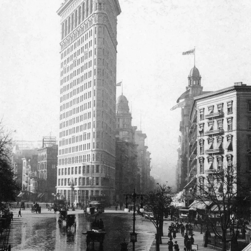
Architecture in Black & White: Reading Geometry Through Light and Shadow Edges
How shadow falloff on planar surfaces, hard graphic edges and the absence of colour make monochrome a natural language for architectural form.
Written in by Simon Lehmann Editor
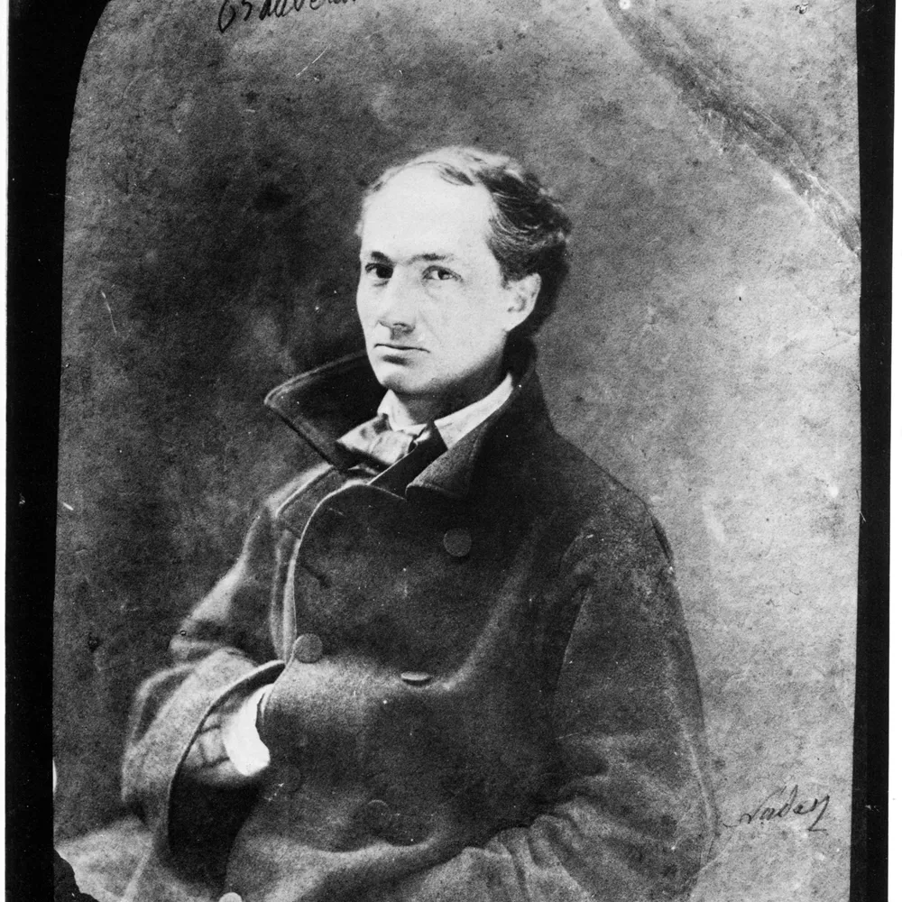
A face carries its information in transitions: the slope from brow to cheekbone, the bridge of the nose, the recession of the jaw. Frontal, even light flattens those transitions into a featureless record of skin. Low-key portraiture takes the opposite approach, using a single hard source to throw most of the face into shadow so that the few illuminated planes describe its structure. The aim is not darkness for its own sake but modelling, the same problem the painters of the seventeenth century solved with chiaroscuro.
The term derives from the Italian chiaro (light) and scuro (dark). Encyclopaedia Britannica defines it as the use of strong contrasts between light and dark to model three-dimensional volume on a flat surface; it originates in the Renaissance and is most associated with Baroque art. Caravaggio (1571-1610) drove the contrast to its extreme, spotlighting figures against inky near-black grounds. That extreme manner was named tenebrism retrospectively by later art historians, from the Italian tenebroso, “dark” or “gloomy” (ultimately Latin tenebrae, darkness); it emerged in Italy in the late sixteenth and early seventeenth century and was carried into Spain by the Caravaggisti such as Jusepe de Ribera and Francisco Ribalta. Rembrandt van Rijn (1606-1669) used a softer, more enveloping light that let shadow describe character rather than spectacle. Both depended on a single dominant source and a willingness to let large areas fall to black, the defining condition of low-key work in any medium.
Two portrait patterns sit at the dramatic end of this scale, each built from one key light and little or no fill. Split lighting places the source roughly perpendicular to the subject, lighting one half of the face and leaving the other in shadow; the division runs down the centre, and the effect is assertive and graphic. Rembrandt lighting raises and swings the key, conventionally to an azimuth of roughly 30-45 degrees off the subject’s axis and an elevation of perhaps 40-60 degrees above eye level, until the nose shadow meets the cheek shadow and encloses a small, lit triangle on the far cheek. The convention attributed to studio portrait practice is that this triangle should be no wider than the eye and no longer than the nose.
The hardness of the source governs how abruptly each shadow edge falls. That edge is set by the source’s apparent angular size as seen from the subject: a physically small or distant source subtends a small angle and casts a hard, narrow penumbra, while enlarging the source or moving it closer widens the penumbra and softens the transition. A bare seven-inch reflector at 1.5 m subtends only a few degrees at the face and renders the triangle’s edge as a crisp line; swap it for a one-metre softbox at the same distance and the source now subtends roughly 35 degrees, so the same triangle dissolves into a broad gradient. For the crisp transitions both patterns depend on, keep the source small and undiffused.
The technical risk is that the dark side records as a featureless void. The lighting ratio, measured as (key + fill):fill, sets where that side lands. Ratio relates to stops as 2^(stop difference):1, so 2:1 is one stop, 4:1 is two, and 8:1 is three: if the key reads f/8 and the fill reads f/2.8, three stops down, the ratio is 8:1. Three stops is about the practical floor for holding shadow detail, and the reason sits on the characteristic curve. Each zone is one stop. Place the lit cheek of average light skin on Zone VI, the standard portrait highlight, and a three-stop drop lands the shadow side on Zone III, the darkest value still carrying adequate texture. Open the ratio wider and the shadow falls to Zone II (textured black, only slight detail) or Zone I, and structure is gone.
Close the loop with the meter. Load HP5 Plus and rate it at EI 400. A reflected meter is calibrated to Zone V, middle grey at 18% reflectance, so its reading places whatever it sees on Zone V. Spot-meter the shadowed cheek and stop down two stops from that reading to place it on Zone III; if the meter says f/4 there, set f/8. Now meter the lit cheek: for the face to land on Zone VI it should read one stop above the Zone V meter value at your chosen aperture, which is exactly the three-stop separation the 8:1 ratio produces. The textural range that survives onto film runs from Zone II to Zone VIII; the full dynamic range of useful negative density runs from Zone I to Zone IX. Keeping the cheek on III and the highlight on VI sits the whole face comfortably inside both.
Exposure controls the shadows; development controls the highlights. Reduced development lowers highlight density with little effect on the thin, toe-region shadow densities, which is the basis of expose for the shadows, develop for the highlights. That gives a second contrast control alongside the lighting ratio. Develop HP5 Plus in Ilford ID-11 at 20°C: stock dilution 7½ minutes, 1+1 for 13 minutes, 1+3 for 20 minutes. Ilford’s agitation regime is four inversions in the first 10 seconds, then four inversions in the first 10 seconds of each subsequent minute; for continuous tray agitation, cut the times by up to 15%.
If the subject brightness range runs longer than the ratio you metered, an N-1 contraction pulls the highlights back without sacrificing the Zone III shadow, so a hot key reads with texture rather than blocking up. If a low-key set comes out too flat, an N+1 expansion of roughly +40% development for a conventional cubic-grain film like HP5 Plus lifts Zones VI to VIII by a zone and restores separation. HP5 Plus is rated ISO 400/27°, but for available-light low-key work it can be pushed to EI 3200/36° with extended development in DD-X, Ilfotec HC, Microphen or RT Rapid, trading grain for the deep shadow the look already courts. Its long, gently rolling characteristic curve resists blocking up in the highlights and holds separation in hair and dark clothing; Kodak Tri-X 400, the other ISO 400 cubic-grain emulsion, renders harder and grittier if you want a more contrast-forward signature.
Low-key blacks are finished on paper, and this is the back half of controlling the shadow tonally. The Zone III you metered and developed for must survive onto the print as a textured near-black rather than collapsing into paper-base black. Fibre-based paper carries a deeper maximum black, a higher Dmax, than resin-coated, so the deepest tones read as dense and luminous rather than chalky; the trade is longer washing and drying. Grade choice tunes the rest: a too-flat negative prints up on grade 4 or 5 to recover the snap a low-key portrait wants, while a contrasty negative drops to grade 1 or 2 to keep the lit cheek off paper-white. The negative gives you the latitude, but the print is where the dark side either holds its modelling or goes mute.
Image: Nadar (Gaspard-Félix Tournachon), portrait of Charles Baudelaire, 1855, via Wikimedia Commons / Library of Congress (public domain)
· 8 min read
How shadow falloff on planar surfaces, hard graphic edges and the absence of colour make monochrome a natural language for architectural form.
· 6 min read
How Bill Brandt traded tonal fidelity for stark blacks, bleached whites, and the steep distortion of a wide-angle police camera.
· 7 min read
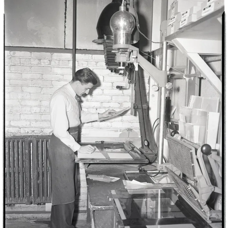
Why condenser and diffusion enlarger heads render contrast and grain differently, the Callier effect behind it, and how to choose between them.
The grainmag companion app
Meter and place your tones without a signal. No account, no internet required — just you, the light, and the grain.