· 6 min read
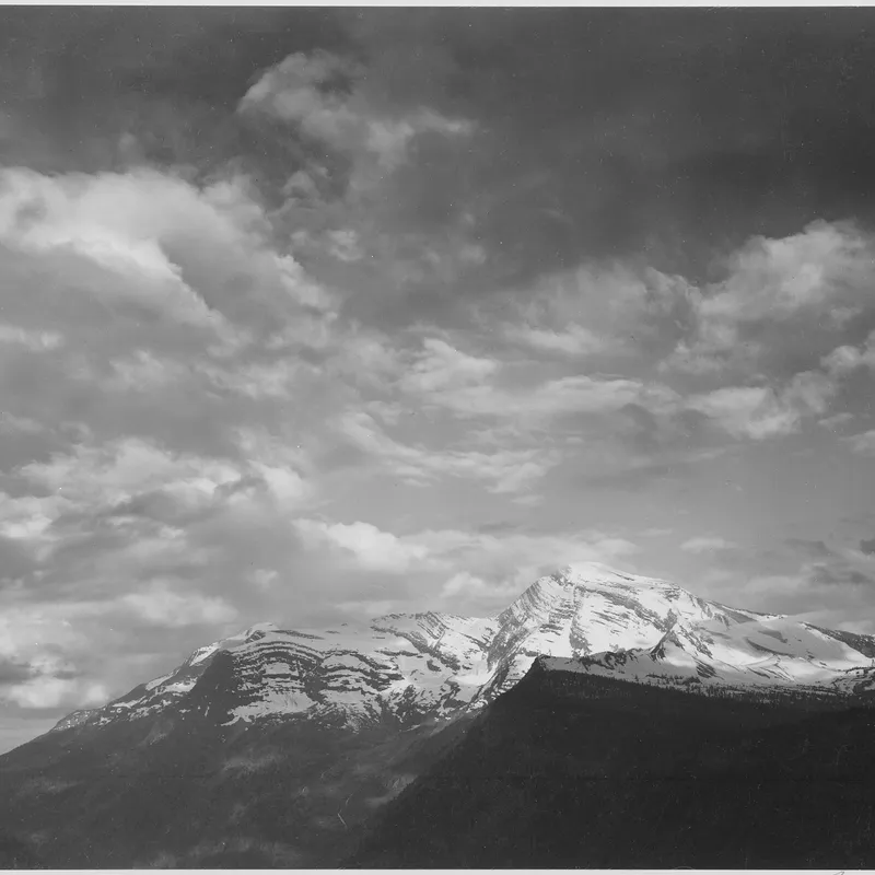
The Negative as Score: Adams, Print Values, and the Logic of Dodging and Burning
How Ansel Adams treated the negative as a fixed score and the print as performance, holding back and burning in to realize a visualized tonal scale.
Written in by Simon Lehmann Editor
The photographs of Sebastião Salgado are recognised less by subject than by tonal structure: luminous skies that fall away into near-black foregrounds, figures and landforms modelled in long, unbroken gradations of grey. The look is often credited to the printing, but it begins at exposure, in a consistent preference for diffuse light and in choices that protect the textural range of the negative. Genesis, the project on untouched landscapes, wildlife and remote peoples that Salgado shot across 2004 to 2012 over thirty-plus expeditions and that opened at the Natural History Museum in London on 11 April 2013, is instructive because midway through it he abandoned film for digital capture while keeping a continuous-tone film negative and a chemical print at the end of the chain. Working out how the two ends were reconciled clarifies what actually produces the drama.
Heroic tonality depends on a scene whose luminance range the negative can hold without losing the extremes. The Zone System that Ansel Adams and Fred Archer formalised around 1939–40 sets the terms: of the eleven zones, Zone V is mid-grey, Zone III is the darkest shadow that still shows full texture, and Zone VII the lightest textured highlight. That gives roughly seven stops of textural range between III and VII, sitting inside a full black-to-white span of about ten stops, and that seven-stop window is close to what a fibre or baryta print can actually render.
The trouble is the world. A sunlit landscape can span twelve to fourteen stops between specular cloud and shaded hollow, which is two to three times wider than the print can carry, forcing a choice between blown white and blocked black. Soft light closes the gap. At ISO 100 the Sunny-16 baseline is about EV 15; cloudy-bright falls to EV 13–14, overcast to EV 12, heavy overcast to EV 11, and open shade to roughly EV 10. The lower exposure value is not the point. What matters is that the subject luminance ratio collapses with it, from twelve-plus stops toward the seven a print can hold.
A worked placement makes this concrete. Spot-meter the deepest open-shade hollow and place it on Zone III; under hard sun the brightest cloud might then read Zone VIII or IX, beyond the paper and beyond a normal-development negative, so you would have to compromise. Under heavy overcast the same cloud falls on Zone VII or VIII instead, inside the textural range, and the whole scene fits on a straight, normally developed negative. This is why Salgado’s skies read as high-key brilliance rather than empty paper and his shadows as dense but legible rather than dead: the contrast was already softened by the weather and the hour before he metered it.
The first Genesis phase, from 2004 to 2008, was shot on an analogue Pentax 645, a medium-format body whose 6×4.5 cm negative carries roughly 270 per cent more area than 35 mm. Salgado reportedly chose Pentax in part because its lower-contrast lens rendering matched the Leica look he had spent decades with. The stock was Kodak Professional Tri-X 320 (320TXP), rated ISO 320, loaded in 220 rolls of thirty-two frames rather than Tri-X 400, which Kodak supplied only in sixteen-frame 120, the extra frame count mattering on long expeditions. 320TXP is a longer-toe emulsion than 400TX, and that long toe holds shadow separation gracefully, which suits a body of work built on shadow-rich terrain. Per Kodak’s F-4017 datasheet, 320TXP in D-76 stock runs roughly 4.5 to 6.75 minutes across 18–24 °C, with Kodak warning that tank development times under five minutes give poor uniformity. The exposed 6×4.5 negatives were digitised on an Imacon (Hasselblad Flextight) scanner.
Around 2008 Salgado moved fully to a Canon EOS-1Ds Mark III, a 35 mm full-frame body with a 21.1-megapixel sensor, in part to escape the cumulative fogging of mandatory airport hand-inspection refusals after 2001 that no longer reliably spared film from the X-ray belt. The capture became digital; the method did not. He had a focusing screen marked for the 6×4.5 proportions fitted, so the viewfinder still framed a 645 image, and he kept editing from printed contact sheets with a loupe rather than on screen, selecting around a hundred frames per trip from many thousands. The film photographer’s discipline was preserved around a digital sensor.
The crossover happens after capture. Raw files are processed to mimic a Tri-X tonal curve, with most of the dodging, burning and contrast work done in software, then sent to a Paris lab, Dupon, where a Kodak LVT recorder writes them back onto large-format black-and-white sheet film. The LVT is an RGB continuous-tone film recorder, originally a Kodak/Light Valve Technology development, that exposes E-6, C-41 and black-and-white stock at three resolutions: RES40, RES80 and RES120, or 1016, 2032 and 3048 dpi (40, 80 and 120 pixels per millimetre). Input is prepared as 8-bit RGB TIFF in the Adobe RGB (1998) profile, and the output is dot-free and scan-line-free continuous tone, typically on 4×5 or 8×10 sheet. Because the tonal decisions were already settled in software, the resulting negative needs little work at the easel when it is enlarged and printed.
The shorthand of “silver gelatin” flattens what is really at least three processes. Some prints are conventional silver-gelatin enlargements made in the darkroom from those LVT negatives. The touring exhibition, however, showed roughly two hundred images on Ilford Galerie Prestige Gold Fibre Silk, a 310 gsm baryta paper with a silk surface that imitates traditional photo paper but is in fact an inkjet baryta, not a wet-darkroom emulsion. Separately, limited Genesis editions exist as platinum/palladium prints on Arches Aquarelle, chosen, per the V&A’s Martin Barnes, for their tonal range and permanence.
What unites the silver-gelatin and the baryta-inkjet routes is the substrate physics. A baryta or fibre paper carries a reflective barium-sulphate sub-layer beneath the image, and the fibre base gives a longer tonal scale and a higher maximum density than resin-coated or matte inkjet papers. That is the mechanical reason the deep, neutral black and the smooth highlight roll-off survive on the wall rather than collapsing into a flat grey, the same heroic tonality the soft light and the careful placement set up at the start of the chain.
· 6 min read
How Ansel Adams treated the negative as a fixed score and the print as performance, holding back and burning in to realize a visualized tonal scale.
· 8 min read
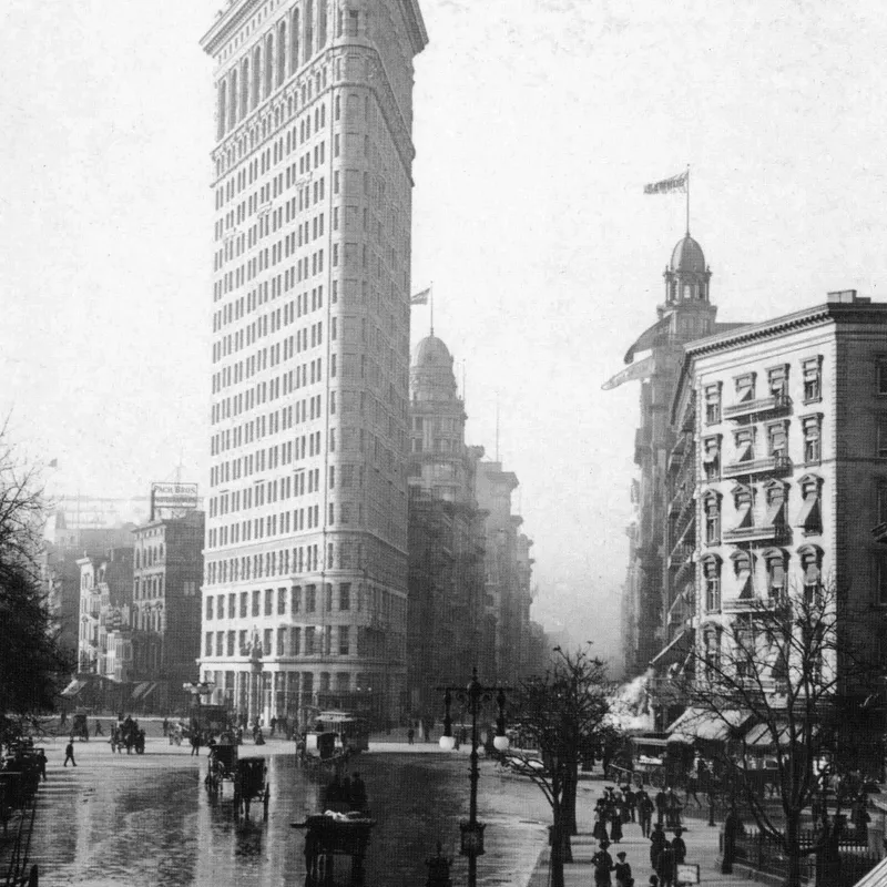
How shadow falloff on planar surfaces, hard graphic edges and the absence of colour make monochrome a natural language for architectural form.
· 6 min read
How Bill Brandt traded tonal fidelity for stark blacks, bleached whites, and the steep distortion of a wide-angle police camera.
The grainmag companion app
Meter and place your tones without a signal. No account, no internet required — just you, the light, and the grain.