
· 6 min read
Bill Brandt: High-Contrast Printing and the Wide-Angle Nude
How Bill Brandt traded tonal fidelity for stark blacks, bleached whites, and the steep distortion of a wide-angle police camera.
Written in by Simon Lehmann Editor
A single negative can yield two distinctly different prints depending only on how the enlarger illuminates it. A frame of Tri-X 400 that settles at grade 2 under a diffusion head can want grade 1 under a condenser to hold the same highlight separation, and the grain that looks crisp in one print can soften in the other. The cause is not the lens or the paper but the geometry of the light reaching the emulsion, and the physical mechanism connecting the two is the Callier effect.
A condenser enlarger places one or more large lenses between the lamp and the negative. These condensers collect the light and form a roughly collimated, directional beam that passes through the emulsion as specular light, travelling in nearly parallel rays. A diffusion enlarger instead places the negative below an integrating chamber or a sheet of opal material, so the light arrives from a wide range of angles. Dichroic colour heads (Durst, Kaiser, the Leitz Focomat) are the most common diffusion variant today, joined by classic cold-light tubes and, more recently, dedicated LED variable-contrast heads.
The distinction matters because silver image grains do not simply absorb light; they also scatter it. In dense, highly developed areas of the negative the accumulated silver scatters a portion of the transmitted beam out of its original path. Under directional condenser illumination, light scattered away from the optical axis is effectively lost from the imaging path, so dense areas read as even denser. Under diffuse illumination, light is already arriving from all angles, and scattered rays are continually replaced by rays scattered into the path from neighbouring directions, so the same silver appears less dense.
This dependence of measured density on illumination geometry was first described by André Callier (1877–1938), a Belgian optician, in 1909. The primary paper appeared in German as “Absorption und Diffusion des Lichtes in der entwickelten photographischen Platte” in the Zeitschrift für wissenschaftliche Photographie, Photophysik und Photochemie 7, 257–272; the widely-cited English short form is “Absorption and scatter of light by photographic negatives,” J. Phot. 33 (1909). A rigorous optical treatment, accounting for coherence rather than geometric scattering alone, came much later from Chavel and Loewenthal in 1978 (J. Opt. Soc. Am. 68(5):559).
The effect is quantified by the Callier coefficient, or Q factor, defined as Q = D_dir / D_dif — the ratio of specular (directional) density to diffuse density. Because scattering can only remove light from a directional beam, Q is always greater than or equal to 1. For typical silver emulsions Q commonly exceeds about 1.2, and it is not constant across the negative: it rises with diffuse density, because denser highlights contain more silver and therefore scatter proportionally more light. Since the highlights of a negative correspond to the shadows of the print, a condenser head expands the negative’s density range non-uniformly, stretching the contrast most where development has laid down the most silver.
Q does not depend on density alone; it depends strongly on grain size. Larger developed silver grains scatter light more effectively, so a coarse-grained, fast emulsion shows a higher Callier coefficient and a bigger condenser-versus-diffusion swing than a fine-grained one. The relationship is precise enough to run in reverse: the median developed-grain diameter is a logarithmic function of the specular-to-diffuse density ratio, which is exactly why the Callier quotient is used to measure grain size (SMPTE, “Grain Size Determination and other Applications of the Callier Effect”).
The practical message is that the choice of head matters most for the grainy films and least for the smooth ones. A fast 35mm stock such as Tri-X 400 or HP5 Plus will show close to the full grade of difference; a fine-grained sheet film such as FP4 Plus or T-Max 100 will show nearer half a grade on the same enlarger.
Take a worked case. Suppose you have a frame of Tri-X 400 developed in D-76 1+1 at 20°C (68°F), and a densitometer reads a diffuse density range of about 1.05 over the printing scale — a normal contrast index for grade 2 on a diffusion head. Put that same negative under a condenser and the highlights, where Q runs well above 1, read with inflated specular density; the effective range stretches to roughly 1.3–1.4, which is about a grade harder. To hold the print you drop from grade 2 to grade 1. Repeat the exercise with T-Max 100, whose finer grain gives a lower Q, and the stretch is smaller — closer to half a grade — so a half-grade of variable-contrast filtration recovers the match.
Rather than fight the difference at the easel, you can build it into development. Kodak’s published practice, on development charts since at least the early 1950s, is to develop a condenser-bound negative roughly 30% less than a diffusion-bound one — that is, to a lower density and contrast range so the condenser’s contrast gain lands you back at a normal grade. With a developer such as D-76 or HC-110 this means matching your target contrast index to the head rather than over-developing and then printing soft. The dust-and-scratch trade follows the same optics: collimated condenser light casts a hard, unfilled shadow at a surface defect, so a dust mote prints as a sharp black speck, whereas diffuse light fills that shadow from neighbouring angles and the same mote nearly vanishes — the very geometry that drives the contrast difference also drives blemish suppression. Diffusion heads run cooler, too, which reduces the risk of negatives buckling under heat during long exposures.
Neither source is inherently superior; each trades one set of properties for another. If you print on variable-contrast paper, the light-source spectrum becomes a second consideration. Ilford Multigrade carries two emulsions — a low-contrast layer sensitive to green light and a high-contrast layer sensitive to blue — and grade is set by the green-to-blue ratio. Classic cold-light tubes emit predominantly blue, which over-exposes the high-contrast layer and pushes prints harder than the filtration suggests; this is exactly why Aristo and others later built dual-tube VC cold-light heads, and why dichroic and dedicated Multigrade heads give cleaner grade control. One useful exception removes the head question entirely: a black-and-white chromogenic film developed in C-41, such as Ilford XP2 Super (or the discontinued Kodak BW400CN), forms its image from dye clouds that absorb rather than scatter light, so Q approaches 1 and printed contrast is nearly independent of which enlarger you stand it under.
Ansel Adams printed almost exclusively under diffuse cold-light sources, considering them more in harmony with the negative’s inherent tonality, and in The Negative (1981, Ch. 10) he gives separate Zone I, IV and VIII density targets for condenser versus diffusion enlargers rather than treating one negative as fit for both. The reasoned choice therefore depends on the negatives at hand: condenser heads suit thin or low-contrast negatives and reward immaculate film handling, while diffusion heads suit dense or contrasty negatives, forgive minor physical flaws, and — particularly with grainy 35mm — keep contrast closer to where development put it.
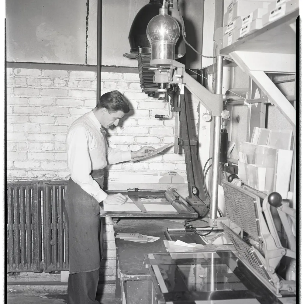
Image: Ford Bowers printing photographs at an auto-focus enlarger, Dow Photographic Laboratory (1947), via Wikimedia Commons, public domain
· 6 min read
How Bill Brandt traded tonal fidelity for stark blacks, bleached whites, and the steep distortion of a wide-angle police camera.
· 6 min read
How a single hard light, deep shadow and minimal fill build Rembrandt and split lighting, and how the Zone System keeps the dark side readable.
· 9 min read
How fixed-grade and variable-contrast papers reshape a negative's tonal range, and how enlarger filtration sets contrast under the lens.
The grainmag companion app
Meter and place your tones without a signal. No account, no internet required — just you, the light, and the grain.