· 8 min read
Architecture in Black & White: Reading Geometry Through Light and Shadow Edges
How shadow falloff on planar surfaces, hard graphic edges and the absence of colour make monochrome a natural language for architectural form.
Written in by Simon Lehmann Editor
A photograph is read as a relationship between what occupies the frame and what surrounds it. Negative space is the open ground around and between the subjects, the field against which a positive form is recognised. In colour, that ground carries its own competing information: hue, saturation, the warmth or coolness of light, each a thread the eye can follow. Stripped to a tonal scale, an empty region collapses into a single variable, brightness, which on the print is simply a density on the paper. With nothing else to read, the field stops being incidental background and becomes a measurable weight you place as deliberately as the subject itself.
The reason a subject lifts away from negative space is perceptual, not metaphorical. The Danish psychologist Edgar Rubin studied it formally around 1915 in the figure-ground experiments that produced the vase-faces image: at any border between two regions, the visual system assigns the contour to one side, and that side becomes the figure while the other recedes into formless ground. You cannot see both readings at once. Sugimoto’s bisected seascape and Rubin’s vase work the same way; what differs is how hard the image makes the decision.
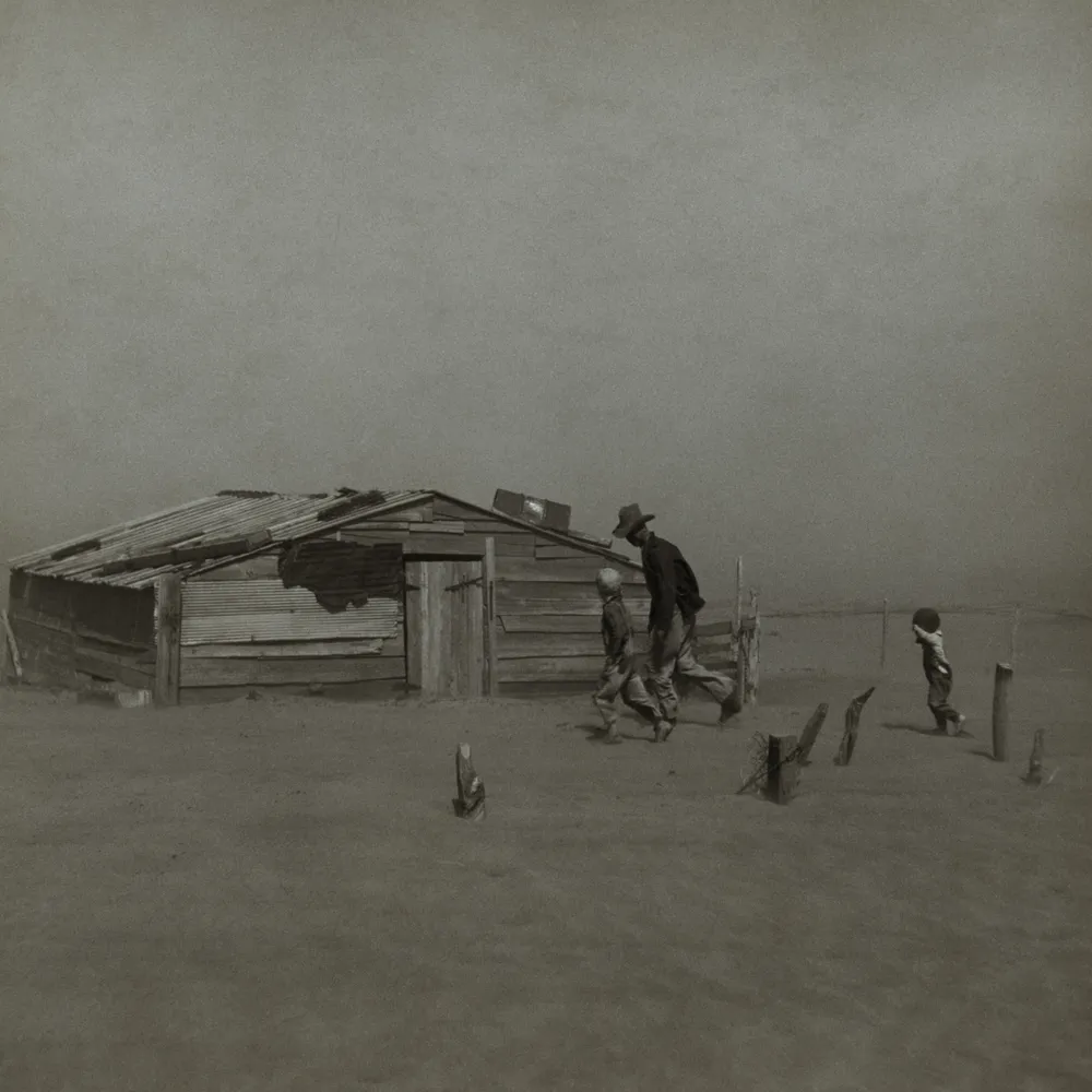
A field of a single value gives the visual system nothing to claim as a competing figure. There is no internal edge inside it for the contour to attach to, so every border in the frame belongs to the subject, and the eye assigns figure status to the one interruption without hesitation. This is the actual mechanism behind isolation, and it is why monochrome sharpens it: a colour ground offers secondary edges, a saturation boundary or a warm-cool seam, that can pull a second figure out of the background. Reduce the ground to one brightness and those rival edges vanish.
A featureless field has to be put somewhere on the tonal scale on purpose. The Zone System gives the vocabulary. Devised by Ansel Adams and Fred Archer at the Art Center School in Los Angeles around 1939 to 1940, and set out definitively in Adams’s The Negative (1981 revised edition, written with Robert Baker), it anchors Zone V to middle grey at 18 per cent reflectance, the value every reflected-light meter is calibrated to read. Each zone is one stop from the next, a factor of two in exposure. The textural range runs from Zone II, the darkest tone that still records detail, to Zone VIII, the lightest with texture. Below Zone II detail falls away into near-black; above Zone VIII it bleaches toward Zone IX, glaring snow with slight tone but no texture. A clean empty field lives deliberately at or just inside those limits.
Work a high-key sky as an example. Spot-meter a pale overcast and the meter, calibrated to 18 per cent grey, renders it as Zone V, too dark and dull. Open the lens two stops to place it on Zone VII or VIII and it becomes a luminous, smooth high-key field that still sits inside the textural range, rather than tipping to paper-white Zone IX where it would block to a featureless blank with a hard edge against the sky. The reciprocal case for a low-key field: let a dark wall fall where the meter puts it, or close down so it lands on Zone I or II, and it reads as an enclosing near-black with no detail, pressing in on the subject. The choice between floating and enclosing is a metering decision before it is an aesthetic one.
A smooth empty expanse is the hardest thing to render cleanly, because any unevenness has nothing to hide behind. Film choice sets the starting point. Ilford FP4 Plus, ISO 125/22°, is a traditional cubic-grain emulsion with an S-shaped characteristic curve that compresses the highlights, so a bright sky rolls off into a smooth tone instead of climbing straight to clear film and blocking up. Delta 100 uses tabular core-shell grain technology and a longer, straighter curve that holds more linear, extended highlight separation, useful when you want graduated tone across the field rather than a roll-off, at the cost of being more sensitive to development, where small changes in development time shift contrast more readily than with a traditional emulsion.
The development itself is where an even sky succeeds or fails. A workable recipe for FP4 Plus is ID-11 diluted 1+1 for 11 minutes at 20°C/68°F, rated at its box speed of EI 125; the same film runs 8½ minutes in ID-11 stock or 15 minutes in Rodinal 1+50 at the same temperature. The failure mode is uneven development across the flat area, bromide drag and mottling, streaks and patches that betray the field as anything but uniform. Ilford’s intermittent agitation regime is the standard defence: invert the tank four times during the first 10 seconds, then four inversions in the first 10 seconds of every subsequent minute, keeping fresh developer moving across the surface without the irregular sloshing that leaves marks. For the finest grain inside the field choose Perceptol stock; for maximum sharpness, Ilfosol 3 at 1+9 or ID-11 at 1+3.
A low-key expanse depends on the print, not just the negative. A deep enclosing field reads as a void only when it reaches the paper’s maximum black cleanly while staying just below textured black, around Zone I to II, so the surface is dense rather than muddy grey. That depends on the paper getting to its Dmax without the shadows lifting into flat charcoal. A fibre-based paper such as Ilford Multigrade FB Classic carries a deeper, more convincing black than resin-coated stock, which is why a print built around a dark field is usually made on fibre. Contrast grade does the rest: too soft and the void greys out and loses its enclosing weight, so you raise the grade until the empty region sits firmly at the bottom of the scale while the subject keeps its midtone separation.
The device fails when proportion is mishandled. Too little surrounding space crowds the subject and isolation collapses; too much and the image reads as merely empty rather than composed. The two opposite solutions both work when chosen deliberately. An off-centre small subject set against a large field uses the contrast in area: the eye settles on the one interruption. A centred horizon does the reverse, splitting the frame into balanced halves. Hiroshi Sugimoto’s Seascapes, begun in 1980 and continuing across four decades over roughly 250 bodies of water, take the centred case to its limit. Each frame is bisected by the horizon into half sea, half sky, made on an 8x10 large-format view camera on black-and-white film, with exposures of up to about three hours that flatten every wave and cloud into two near-featureless bands. Held in collections including the Museum of Modern Art, they show balance carried almost entirely by the weight of two empty fields, the proportion fixed at one to one and everything left to the difference between the tones.
Image: Arthur Rothstein, Farmer and sons walking in the face of a dust storm, Cimarron County, Oklahoma (1936), U.S. Library of Congress / FSA, public domain
· 8 min read
How shadow falloff on planar surfaces, hard graphic edges and the absence of colour make monochrome a natural language for architectural form.

· 8 min read
How Cartier-Bresson fused timing with internal geometry, composing the full 35mm frame in the viewfinder and printing uncropped, with the Leica as a discreet tool.
· 6 min read
In monochrome a line is wherever light meets dark. How luminance edges, not colour boundaries, carry the eye through a black and white frame.
The grainmag companion app
Meter and place your tones without a signal. No account, no internet required — just you, the light, and the grain.