· 8 min read
Cartier-Bresson: The Decisive Moment as Frame Geometry
How Cartier-Bresson fused timing with internal geometry, composing the full 35mm frame in the viewfinder and printing uncropped, with the Leica as a discreet tool.
Written in by Simon Lehmann Editor
Buildings are, before anything else, arrangements of planes meeting at edges. Colour carries information about a facade, but it also competes with the underlying geometry. Stripping a scene to a tonal scale removes that competition, leaving only the relationships that describe form: how brightly a surface is lit, how abruptly one plane gives way to another, and where shadow erases structure entirely. Monochrome suits architecture precisely because those relationships are what the medium records most directly. The film you choose should serve that aim. A fine-grain, high-sharpness emulsion such as Ilford FP4 Plus (ISO 125/22) holds planar detail and renders a clean plane-to-plane edge without grain breaking up the line; Kodak T-Max 100 and Ilford Delta 100 do the same job at slightly higher resolution. Ilford characterise FP4 Plus as fine grain with outstanding sharpness, which is exactly the quality an architectural negative needs.
The gradient of light across a flat wall is governed by a physical relationship, not by artistic choice. A matte building surface behaves approximately as a Lambertian reflector: as described by Lambert’s cosine law (J.H. Lambert, Photometria, 1760), the illuminance falling on it is proportional to the cosine of the angle between the incoming light and the surface normal. A wall facing the sun directly receives full illumination; as the same wall turns away, the cosine term shrinks toward zero at grazing incidence, and the surface darkens smoothly toward black.
Translate that gradient into stops and it becomes a working tool. Light striking a wall at 45 degrees delivers cos 45 = 0.71 of the head-on illuminance, about half a stop down; at 60 degrees, cos 60 = 0.5, a full stop; by 75 degrees the surface has lost two stops and is sliding into deep shadow. A long facade raked by low side light therefore runs a continuous two- to three-stop ramp from bright to near-black, and that ramp alone tells the eye the plane is flat and receding. In colour, hue can mask the gradation; in black and white, the cosine falloff becomes the dominant signal, so an even wall is rendered as legible three-dimensional form.
The cosine ramp only becomes structure once you decide where it sits on the tonal scale, which is what the Zone System is for. Your reflected-light meter is calibrated to Zone V, the 18% middle grey it assumes any reading to be; that is the anchor from which every other placement is reckoned. Zone III is the darkest zone that still holds clearly textured shadow detail, Adams’ standard shadow placement, and Zone VIII the brightest textured highlight.
Meter the brightest sunlit masonry and place it on Zone VI to VII, where stone or render keeps its texture rather than blocking up. From there the cosine falloff carries the wall down the scale on its own: the half-stop point lands around Zone VI, the one-stop turn near Zone V, and where the plane swings away two to three stops it drops to Zone III or below. The decision that matters is the shadow side. Spot-meter a deep cast shadow and ask whether it should fall on Zone II or III, where the negative still carries detail you can print, or below Zone II, where it becomes the empty black that lets the lit geometry read as pure edge. That single choice, made before you trip the shutter, is the difference between a record of a building and a description of its form.
Where two planes meet at an angle their illumination angles differ, so their tones differ, and the boundary becomes a graphic edge. The sharpness of that edge is set by the angular size of the light source. The sun subtends only about 0.5 degrees of arc, a near-point source, so it casts shadow edges with a very narrow penumbra: a sunlit face and a shadowed face are separated by a line with almost no transition. An overcast sky is the opposite, a source spread across the whole hemisphere, whose wide penumbra smears every plane-to-plane transition and collapses the tonal separation that defines structure. This is why high, hard light favours architecture even though the same hard transition is unflattering on a face.
Overcast contrast can be recovered, in two stages. At development, expanded processing lifts the tonal range: give the negative N+1 or N+2 development by extending the time, pushing the high values up the scale while the placed shadow stays put. At the print, variable-contrast (multigrade) paper carries the rest, a grade 3 or 4 filtration restoring the snap that flat light removed from the negative.
Architecture is usually shot against sky, and the sky is controllable through filtration. A coloured filter passes its own colour and absorbs the complementary, so a yellow-to-red filter darkens the blue of a clear sky and the blue skylight that fills open shadows, while broad-spectrum sunlit masonry passes through largely unchanged. The effect is a graduated ladder, each step costing exposure compensation you must dial back in:
A red filter does more than shift exposure: it raises the negative’s contrast index above normal, because it cuts the blue-rich shadows and sky harder than the broad-spectrum highlights, widening the gap between them. The masonry itself is not neutral under that filter. Warm stone, brick and sandstone reflect strongly in the red and lighten under a 25 or 29; cool grey concrete and bluish stone reflect less red and shift far less, so the same filter that throws the sky to black can also pull a brick wall a zone brighter while leaving a concrete one near where it was.
Take a concrete facade in raking late-afternoon sun against a clear sky. Spot-meter three points: the brightly lit face, the shadow side, and the open sky. Place the lit concrete on Zone VII for textured highlight, which sets the exposure. The cosine falloff already carries the wall down toward Zone III where it turns from the sun. Fit a Wratten 25 red, +3 stops of compensation, and the blue sky drops roughly three zones toward black while the broad-spectrum concrete holds its placement. Shoot FP4 Plus at EI 125/22. For maximum sharpness, develop in ID-11 1+3 for 20 minutes at 20C, agitating the Ilford way: invert four times in the first 10 seconds, then four inversions in the first 10 seconds of every following minute. The negative comes back with a textured highlight on the lit plane, a falling cosine ramp into a detailed Zone III shadow, an almost paper-base-white sky, and edges held crisp by the fine-grained emulsion.
This is the method Adams credited as his first conscious visualisation. On 17 April 1927, on the Diving Board on Half Dome, he photographed Monolith, the Face of Half Dome: he first exposed a frame through a K2 yellow filter, judged the sky too light for the feeling he wanted, then re-exposed through a deep-red Wratten No. 29 to render it near-black, the value he had pictured rather than the one the scene presented. That decision became the seed of the Zone System. His books The Negative and The Print remain the primary references for the placement and processing described here.
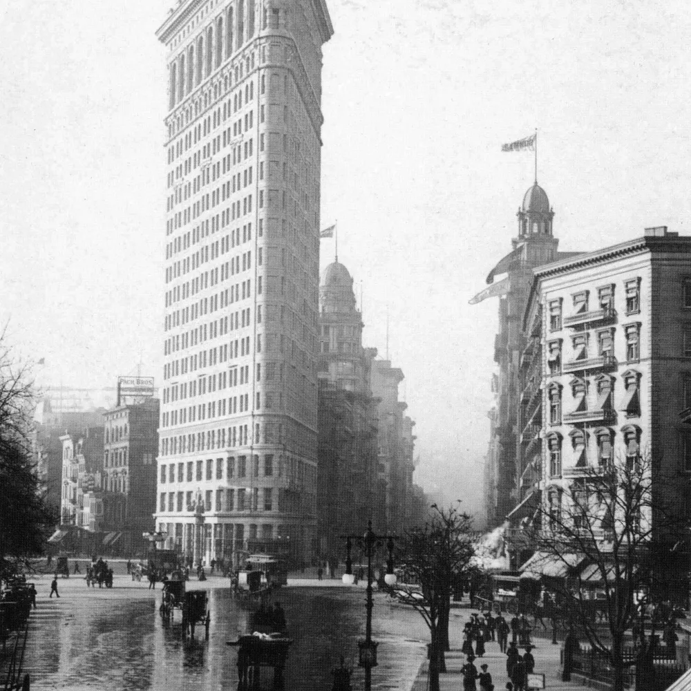
The defining technical problem of the genre is converging verticals. Tilt the camera up to take in a tall building and the film plane is no longer parallel to the facade, so the verticals keystone inward toward the top. The correction is not to tilt at all but to keep the film plane parallel to the facade and raise the lens relative to it: a rising front on a view camera, or a shift / perspective-control lens on a smaller format, moves the image of the upper storeys onto the film without tipping the camera back. The verticals stay vertical because the geometry that bends them never enters the picture.
That correction is inseparable from a deliberate working method. Rise and shift demand a level camera on a tripod, ground-glass or grid alignment to the building, and time spent reading the light before exposure. It is the slow way, but the planes meet where they should, the cosine ramp reads as form, and the geometry survives onto the negative intact.
Image: Flatiron Building, New York (c. 1903), U.S. Library of Congress / Wikimedia Commons, public domain
· 8 min read
How Cartier-Bresson fused timing with internal geometry, composing the full 35mm frame in the viewfinder and printing uncropped, with the Leica as a discreet tool.
· 6 min read
How a single hard light, deep shadow and minimal fill build Rembrandt and split lighting, and how the Zone System keeps the dark side readable.
· 7 min read
How shifting a monochrome scene into the bright or dark end of the tonal scale sets mood, and the metering and lighting each approach demands.
The grainmag companion app
Meter and place your tones without a signal. No account, no internet required — just you, the light, and the grain.