· 8 min read
Architecture in Black & White: Reading Geometry Through Light and Shadow Edges
How shadow falloff on planar surfaces, hard graphic edges and the absence of colour make monochrome a natural language for architectural form.
Written in by Simon Lehmann Editor
Photograph a wall of red brick veined with green lichen and meter both surfaces under flat, overcast light: they read as near-identical mid-greys, somewhere around Zone V. The hue that separates them in colour has collapsed. A contrast filter can pull them apart by tone—a deep red filter lightens the brick and darkens the lichen toward black—but a filter only works while the two surfaces differ in colour. Where two surfaces share a colour, weathered grey on weathered grey, no filter can intervene. The only thing left to separate them is the direction of the light: the micro-shadow cast by one against the highlight on the other. Monochrome removes the crutch of hue, and what remains is luminance, governed almost entirely by where the light comes from.
What reads as “texture” in a print is not the material itself but the pattern of tiny highlights and shadows cast by its surface relief. Every raised grain, pit, and fibre has facets turned toward or away from the source. Facets facing the light render bright; facets turned away fall into shadow. The eye integrates this fine-scale alternation as roughness, weave, or grain.
The conservation technique called raking light makes the principle explicit. The National Gallery in London defines it as the illumination of an object from a source at an oblique angle, or almost parallel to the surface. Conservators direct a single grazing source across a painting precisely because surfaces facing the light receive increased illumination while surfaces turned away cast exaggerated shadows, throwing craquelure, paint cupping, uneven canvas tension, panel warp, and impasto into relief that flat frontal light suppresses entirely. For the photographer, “oblique or almost parallel” translates to a source within roughly 0–20 degrees of the surface plane—sub-10-degree winter sun, or low light skimming in through a side window. Frontal light, by contrast, arrives near the surface normal.
Shadow length is governed by the altitude of the source, not its intensity. The geometry is exact: shadow length equals object height divided by the tangent of the source altitude. A 6-foot post at a 30-degree sun casts a shadow of 6 / tan(30°) = 10.4 feet. Drop the sun lower and the same bump’s shadow grows proportionally longer, exaggerating relief without changing the object at all.
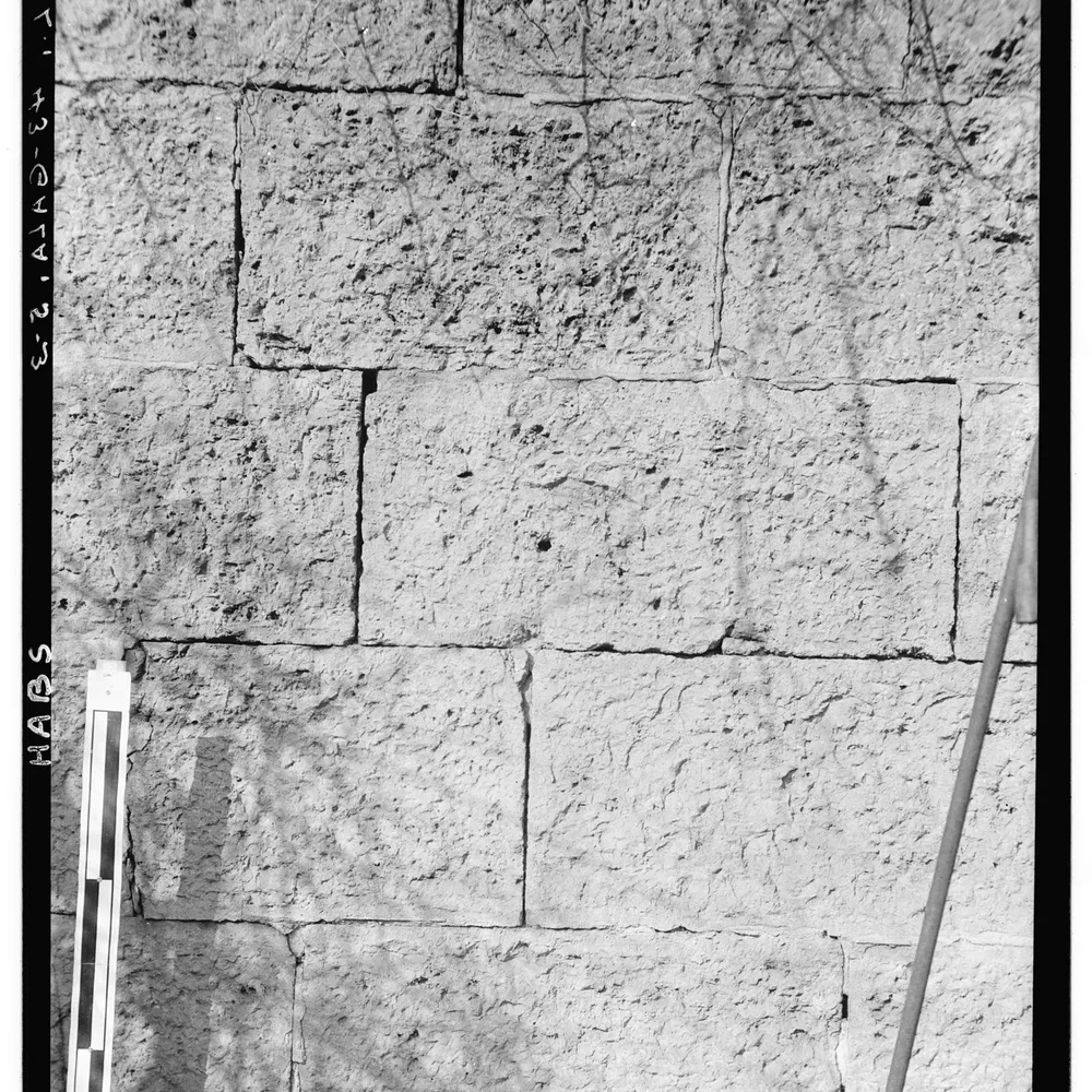
The effect scales straight down to the texture of a surface. A 5 mm raised stone edge on a dry-stone wall, lit at a 10-degree sun, casts 5 / tan(10°) ≈ 28 mm of shadow on the wall plane. The same edge under a 60-degree midday sun casts only 5 / tan(60°) ≈ 3 mm. Nearly a ten-to-one difference in shadow length, from a single bump, decided entirely by where the sun sits. This is why midday overhead light flattens terrain that a low sun rakes into contour, and why a golden-hour sun—between roughly 0 and 6 degrees above the horizon, producing shadow ratios above 5×—turns a featureless field into furrows.
A micro-shadow field only becomes texture in the print if the emulsion can resolve it and the development holds its edges. Two factors decide this. First, the micro-shadow spacing must exceed the resolving and grain scale of the film—shadows finer than the grain simply average out. Second, and more important, edge contrast (acutance) is what makes the bright/dark alternation read as crisp texture rather than mush.
Developer choice is where this lives. Rodinal (R09) is an acutance developer: it does not dissolve grain, so grain stays prominent but edges stay razor-sharp, which is exactly what you want for raking-lit texture. On Ilford FP4 Plus (ISO 125, fine-grain, with moderate grain in the brighter tones) or Delta 100 (ISO 100, a near-grain-free T-grain emulsion), Rodinal yields extremely sharp, texture-emphasising results. Pyrocat-HD, a staining/acutance developer, does similar work on FP4 Plus with low apparent grain and strong tonal separation. A solvent fine-grain developer such as Perceptol does the opposite—it softens edges to smooth grain, and can mush the very micro-relief you set the light to reveal. Same negative, same scene; the development decides whether the texture survives.
Put the geometry and the chemistry together. A dry-stone wall, early golden hour, sun at about 8–12 degrees, on Ilford FP4 Plus rated at its box speed of ISO 125. The raised stone edges throw long shadows—around 28 mm for a 5 mm edge at 10 degrees—so the surface is already a field of strong micro-shadow. Meter the sunlit stone faces and place them on Zone VI; the raking shadows between the stones then fall around Zone III to IV.
That placement is deliberate. In Ansel Adams’ Zone System, set out in The Negative (Book 2 of the Ansel Adams Photography Series), the textural range runs from Zone II to Zone VIII—the band of luminances in which surface texture records and substance is recognisable, with Zone V middle grey and each zone one stop apart. Zones below II and above VIII carry no texture. By placing the lit faces on VI and the shadows on III–IV, both the highlight texture and the shadow texture sit squarely inside II–VIII, so the relief survives onto the print rather than blocking up into black or burning out to paper white. Develop in Rodinal or Pyrocat-HD to keep the edges crisp, and the wall reads as stone you could run a hand over.
Direction and quality of light are separate variables, and conflating them costs texture. A grazing hard source—low bare sun, an undiffused bulb—maximises micro-shadow contrast and renders harsh, gritty texture. A grazing soft source—overcast light skimming a wall, or a large diffused window low to the side—keeps the same directional rake but lowers the micro-shadow contrast, for gentler, more tactile texture. Same angle, different result: light a plastered wall with a hard low sun and every trowel mark bites; light it with the same low angle through a north-facing window and the relief is present but quiet.
The opposite extreme is on-axis flash. When the source shares the lens axis, every feature’s shadow falls directly behind it, hidden from the camera, so the entire micro-shadow field collapses and the surface reads as a single flat tone. This is why front-on flash erases texture. Move the flash even slightly off-axis and the shadows begin to creep into view; carry it round toward grazing and the surface comes back to life. Reading a scene for the position and quality of its light, rather than its colours, is the central act of seeing in monochrome.
Image: Chester Hart, Detail of Stone Wall, S. M. Felt House, Galena, Illinois (1934), Historic American Buildings Survey, U.S. Library of Congress, public domain
· 8 min read
How shadow falloff on planar surfaces, hard graphic edges and the absence of colour make monochrome a natural language for architectural form.
· 6 min read
How a single hard light, deep shadow and minimal fill build Rembrandt and split lighting, and how the Zone System keeps the dark side readable.
· 7 min read
How shifting a monochrome scene into the bright or dark end of the tonal scale sets mood, and the metering and lighting each approach demands.
The grainmag companion app
Meter and place your tones without a signal. No account, no internet required — just you, the light, and the grain.