· 6 min read
The Negative as Score: Adams, Print Values, and the Logic of Dodging and Burning
How Ansel Adams treated the negative as a fixed score and the print as performance, holding back and burning in to realize a visualized tonal scale.
Written in by Simon Lehmann Editor
A black-and-white print carries no colour to signal feeling, so mood rests on where the tones sit. Collecting a scene into the light end or the dark end of the scale is a decision made before the shutter opens, then carried through development and printing. High-key and low-key are the two extremes of that choice, and each places specific demands on metering, lighting, film selection and grade.
The vocabulary comes from the Zone System, devised by Ansel Adams and Fred Archer around 1939-40 at the Art Center School in Los Angeles and codified in Adams’ The Negative (1948, revised 1981). It divides the print scale into eleven zones, 0 to X, each one stop apart, with Zone V as middle grey. Zone 0 is pure black with no detail and Zone X is pure white for light sources and specular reflections. Texture lives in the middle: the textural range runs from Zone II, a textured black with the slightest detail, up to Zone VIII, the lightest tone that still holds texture. Zone IX is tone without texture, and Zone X is paper white. That ceiling matters, because a “textured highlight” can sit no higher than Zone VIII before it surrenders its detail.
Adams’ descriptors give you anchors to place subjects against. Zone III is average dark material and the point at which shadows hold their texture; Zone VI is average light skin and sunlit stone; Zone VII is very light skin. A high-key image lifts nearly everything above Zone V, holding shadows up around Zone VI-VII and capping textured highlights at Zone VIII. A low-key image does the reverse, letting shadows fall to Zone I-II and reserving Zone VII-VIII for a few deliberate accents. Both compress the scale so one half does the work and the opposite extreme appears only as a punctuation mark.
A reflected-light meter renders whatever it reads as Zone V, middle grey. Under ISO 2720 it is calibrated to a reflectance constant K of 12.5 (Sekonic, Nikon, Canon; older Minolta, Kenko and Pentax used K = 14), which corresponds to roughly 12.5% reflectance rather than the 18% of a standard grey card. That mismatch is why a reading taken off an 18% card and an incident reading differ by about half a stop. For tonal work the practical consequence is simple: the meter does not know whether it is looking at snow or coal, and it tries to turn both into Zone V.
So you place the tone yourself, and each zone is exactly one stop away from the next. To put average skin at Zone VI, open up one stop over the meter’s reading of that skin (+1). Snow or a white wall at Zone VIII is +3. A deep shadow you want held just inside texture at Zone II is -3. This is the whole exposure half of high-key and low-key: meter the tone you care about, then open up or close down by the number of stops that carries it to its target zone.
High-key is bright, soft and almost shadowless. It is built on a key-to-fill lighting ratio near 1:1, which is zero stops of difference between key and fill, so the shadows fill nearly to the brightness of the lit side. Each doubling of the ratio adds a stop, so 1:1 is flat by definition.
Take a worked example: a fair-skinned subject against a white background under near-flat light. Spot-meter the cheek. The meter wants Zone V, which would render the skin a muddy grey, so open up +1 to +2 stops to place it at Zone VI-VII. Check the brightest textured part of the background and keep it no higher than Zone VIII so it retains some tooth rather than blocking to paper white. A fine-grain tabular-grain emulsion such as Kodak T-Max 100 gives the smoothest gradation through those upper zones, where any grain or contrast break shows badly. In development, high-key usually wants normal to slightly fuller processing to keep the upper midtones open and separated. At the printing stage, finish on a soft grade, 00 to 1 on Ilford Multigrade, to hold the gentle, airy spacing rather than letting a normal grade pull the tones apart.
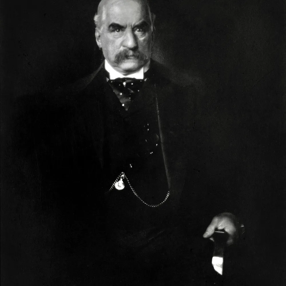
Low-key works in the opposite direction, accentuating shadow and reserving the brightest zones for narrow, sculpted highlights. It is the photographic descendant of chiaroscuro, Italian for “light-dark”, developed by Renaissance painters including Caravaggio and Rembrandt and carried into cinema as Rembrandt lighting and the look of 1940s film noir. It relies on a single hard source with little fill, producing a ratio on the order of 8:1, which is three stops between key and fill.
The worked example mirrors the high-key one. Light the subject with one hard source at roughly 8:1, then meter the shadow you still want to read as just-textured, around Zone II-III. Close down from the meter’s Zone V reading by the appropriate stops, two or three, to let those shadows fall where you want them, then place one or two highlights precisely at Zone VII-VIII so they define form against the dark field. Here a faster emulsion earns its place: Ilford Delta 3200, a tabular-grain film with a native speed near ISO 1000, is lower in contrast than its rival Kodak T-MAX P3200 and holds shadow and highlight detail better, which protects the few tones you are placing in the deep end. Development for low-key is often pulled back slightly to protect highlight separation rather than letting the contrasty lighting run away. Print hard, grade 4 or 5 on Multigrade, for genuinely black blacks and crisp separation in the accents.
Exposure places a tone on the negative; development controls how far the high values climb above it, which is how the scale is actually compressed or stretched. Normal development is “N”. When a scene is too flat, expansion (N+1) means longer development, which lifts a Zone VII placement to print as Zone VIII, raising negative contrast. When a scene is too contrasty, contraction (N-1) means shorter development, bringing a Zone IX subject down to Zone VIII and taming the range. This is the film-side companion to placement: you expose for the shadows and develop for the highlights. In practice low-key scenes lit at 8:1 often call for a touch of contraction to keep the bright accents from blocking up, while a flat high-key set may take a little expansion to give the upper zones some life.
The mood is finally fixed on paper. Ilford Multigrade variable-contrast papers (RC Deluxe and FB Classic) cover the full grade range 00 to 5, selected with Multigrade filters, and grade 2 to 2.5 is the normal grade for a correctly exposed and developed negative. Soft grades 00-1 suit high-key, keeping the open, gentle spacing intact; hard grades 4-5 suit low-key for deep blacks and clean separation in the highlights. Generation 5 Multigrade RC Deluxe was reformulated for deeper blacks and improved mid-grade spacing, which helps most where it matters: the bottom of a low-key print. Metering, placement, development and grade are not separate skills but one chain, and high-key and low-key are simply that chain aimed at opposite ends of the scale.
Image: Edward Steichen, J. Pierpont Morgan (1903), via Wikimedia Commons, public domain
· 6 min read
How Ansel Adams treated the negative as a fixed score and the print as performance, holding back and burning in to realize a visualized tonal scale.
· 8 min read
How shadow falloff on planar surfaces, hard graphic edges and the absence of colour make monochrome a natural language for architectural form.
· 6 min read
How a single hard light, deep shadow and minimal fill build Rembrandt and split lighting, and how the Zone System keeps the dark side readable.
The grainmag companion app
Meter and place your tones without a signal. No account, no internet required — just you, the light, and the grain.