· 8 min read
Architecture in Black & White: Reading Geometry Through Light and Shadow Edges
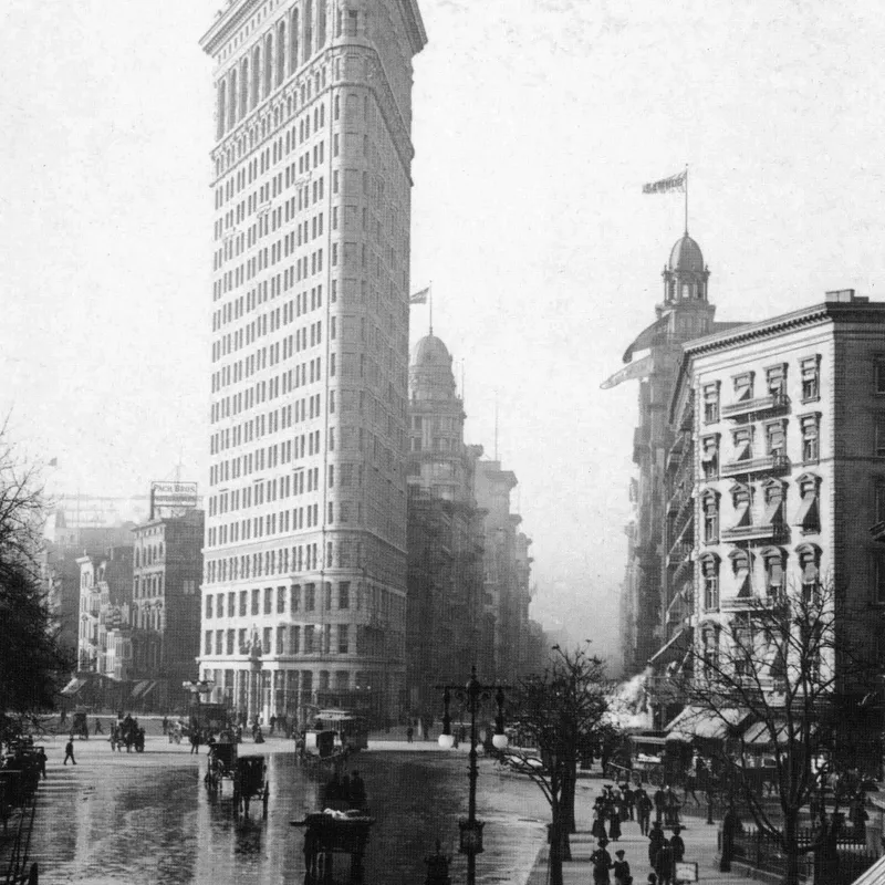
How shadow falloff on planar surfaces, hard graphic edges and the absence of colour make monochrome a natural language for architectural form.
Written in by Simon Lehmann Editor
In colour, a line can be drawn by hue alone: a red rail against green grass reads as a line even when the two are equally bright. Black and white discards that boundary. A roll of HP5 Plus or FP4 Plus is panchromatic — sensitive across the whole visible spectrum — so it does not record red, green or blue as such, only how much light each surface throws back. What survives the conversion to grey is luminance, and in a monochrome frame a leading line is wherever a light tone meets a dark one. Seeing those edges, rather than the objects that form them, is the core of composing in tone.
The visual system is built to register changes in brightness. Contrast sensitivity is bandpass: as the StatPearls reference on contrast sensitivity describes, the human contrast sensitivity function — measured as Michelson contrast across spatial frequency — peaks roughly between 1 and 8 cycles per degree of visual angle and falls away above and below that band. A sharp tonal boundary in the frame sits near that peak, while a soft gradient spreads its energy into the lower frequencies the eye discounts. That is why an abrupt edge draws attention more reliably than a gradual one, and why a continuous run of contrast is read as a line and followed along its length.
This following is measurable. An eye-tracking study by Chuang, Tseng and Chiang in the Journal of Eye Movement Research (2024) found that leading-line images containing a prominent subject drew significantly fewer saccades and longer viewing times than leading-line images without one, the line guiding the gaze to a focal point rather than leaving it to search the frame. The line does not merely decorate the frame; it changes how the gaze travels across it.
Because the eye separates hue from brightness, two colours that look distinct can collapse into the same grey. A red and a green that both meter near 18 per cent reflectance land on the same value — Zone V, the middle grey to which every reflected-light meter is calibrated — and the line between them vanishes. So you stop trusting your eye for hue and read the scene for luminance steps instead. A spot meter aimed at one surface, then the other, gives the gap directly: each one-stop difference is one zone, so a wall reading f/8 against a sky reading f/16 is a two-stop, two-zone edge. The lit and shadowed faces of a single grey wall can form a stronger line than any colour boundary, because the fall of light, not the paint, sets the values.
Orthochromatic film makes the point cleanly. Ilford Ortho Plus 80 (ISO 80) is blind to red, sensitive only to blue and green, so it builds luminance edges colour cannot predict: reds render dark, almost black; blues render light; freckles and red lips go near-black, the opposite of what a red filter does on panchromatic stock. The leading line in an ortho frame is drawn by the emulsion’s own spectral response — which is also why you can develop the film under a red safelight without fogging it.
A coloured filter rewrites the tonal map at capture. It transmits its own waveband and absorbs the complementary one, so on a panchromatic emulsion it lightens its own colour and darkens the opposite. The cost is exposure, paid in the filter factor. From Ilford’s own guidance and the Kodak Wratten data: a medium yellow (Wratten No.8 / K2) has a factor of about 2, one stop, and darkens blue sky a little; a deep yellow (No.15) runs 2.5, about 1-1/3 stops; an orange a factor of 4, around two stops; a red (Wratten No.25 / A) a factor of roughly 8, three stops. The red is the most aggressive because it passes long wavelengths and starves a blue sky of nearly all its exposure, so the sky prints dark and a hue-only horizon becomes a hard tonal step.
Worked example. A clear blue sky meets a sunlit sandstone wall. Unfiltered, both meter close together — say the sky at Zone VI and the warm wall a touch above — and the horizon is a weak, hue-only edge that all but disappears in grey. Fit a No.25 red and add its three stops of exposure: the filter passes the wall’s warm light almost untouched while absorbing the sky’s blue, so the wall holds its placement and the sky drops several zones, down toward Zone III or II. The line that was colour is now luminance, and it will print as a defined boundary instead of a soft join.
Light direction sets the gap before any filter touches it. Grazing, near-axial-to-the-surface light raises the luminance of the lit face and drops the face turned away, opening a two- to three-stop difference across a single texture boundary — a brick course, a furrow, the lip of a step. Confirm it the same way you found it: spot-meter the lit face, spot-meter the shadow face, read the difference in stops. A two-stop reading is a two-zone edge that will hold in the print; a half-stop reading will close up and disappear. The same wall photographed under flat frontal light gives you almost nothing, which is why the hour and angle of light is a compositional decision, not a lighting nicety.
Once you can name the edge in stops, you can decide where to put it. The Zone System — codified by Ansel Adams and Fred Archer in the late 1930s and taught across The Camera, The Negative and The Print — divides tone into eleven zones, 0 to X, each a one-stop interval, with Zone V at 18 per cent middle grey. Place the dark side of your boundary on Zone III and the bright side on Zone VII and you have specified a four-stop edge precisely. Exposure sets the shadow placement; Adams’ rule, expose for the shadows, develop for the highlights, then governs how steep the bright end of that edge becomes.
The print finishes the work. Ilford Multigrade variable-contrast paper runs from grade 0 to grade 5 in half-grade steps, and split-grade printing exploits both ends: a soft grade-0 pass seats the light side of the boundary without blocking the highlights, a hard grade-5 pass sets the blacks of the shadow side, and localised burning deepens exactly the edge that leads. The line is not fixed once. It is found with a meter, scaled by a filter, placed in the negative and reinforced in the print — built and rebuilt across the whole process rather than caught in a single frame.
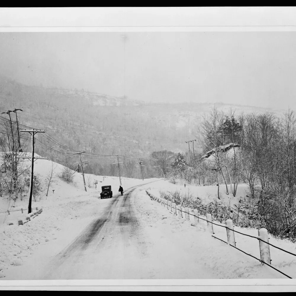
Image: Marion Post Wolcott, Highway after blizzard, Brattleboro, Vermont (1940), U.S. Office of War Information / Library of Congress, public domain
· 8 min read
How shadow falloff on planar surfaces, hard graphic edges and the absence of colour make monochrome a natural language for architectural form.

· 6 min read
How Bill Brandt traded tonal fidelity for stark blacks, bleached whites, and the steep distortion of a wide-angle police camera.
· 8 min read
How Cartier-Bresson fused timing with internal geometry, composing the full 35mm frame in the viewfinder and printing uncropped, with the Leica as a discreet tool.
The grainmag companion app
Meter and place your tones without a signal. No account, no internet required — just you, the light, and the grain.