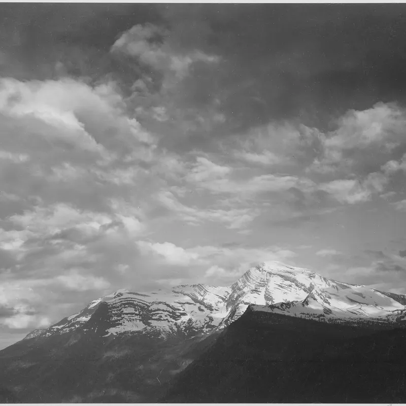
· 6 min read
The Negative as Score: Adams, Print Values, and the Logic of Dodging and Burning
How Ansel Adams treated the negative as a fixed score and the print as performance, holding back and burning in to realize a visualized tonal scale.
Written in by Simon Lehmann Editor
A scene that reads as vivid and varied in colour can flatten alarmingly in black-and-white. A red flower set against green foliage, separated unmistakably by hue, may print as two near-identical greys with no edge between them. The difficulty is that the eye judges a scene by colour, while a monochrome emulsion records only the quantity of light a surface returns. Learning to anticipate that translation, rather than discover it on the contact sheet, is the central discipline of seeing in black-and-white. Ansel Adams named this faculty “visualization”: the ability to picture the finished print, in its full range of greys, before the exposure is made.
The greyscale value of a colour depends on its luminance, the perceived quantity of light, not on its hue. Two surfaces of entirely different colour but similar luminance reduce to the same grey. Human vision is markedly more sensitive to green than to red or blue, so the three primaries do not contribute equally to perceived brightness.
The video industry quantifies this with luma coefficients, and they are a useful first approximation for film. The standard-definition weighting (ITU-R BT.601, 1982) is 0.299 red, 0.587 green, 0.114 blue; the later HD weighting (ITU-R BT.709, 1990) shifts these to 0.2126, 0.7152 and 0.0722. Both sum to one, both put green highest and blue lowest, and the older BT.601 figures are the more conventional “luminosity” approximation. Neither is a film curve. They model display and perception, not emulsion chemistry, and real panchromatic film deviates further still, biased toward blue. Treat the coefficients as a sketch of which colours weigh heaviest, not as a conversion you can trust to the third decimal.
The consequence is that a saturated red and a saturated blue, which appear strikingly different to the eye, both carry low weighting and tend to render as similar dark greys. Foliage, weighted heavily toward green, renders lighter than colour intuition suggests. Hue carries no tonal information once colour is discarded; only the brightness survives.
A panchromatic emulsion, the modern standard, is sensitive across the visible spectrum but not in the same proportions as human vision. Its residual sensitivity to blue is comparatively high, which is why an unfiltered sky often prints lighter and more washed out than memory expects, and why warm, ruddy skin records slightly dark.
The history of the medium makes the point sharply. Orthochromatic film, which preceded panchromatic stock, is sensitive only to blue and green and effectively blind to red. Ilford Ortho Plus is a current example, rated at ISO 80: red lips and red flowers render near-black on it, with higher contrast than a panchromatic film would give from the same subject. That blindness to red has a practical payoff in the darkroom. Because ortho film cannot record red light, it can be handled and developed under a deep-red safelight, where you can watch the image, whereas a panchromatic film such as FP4 Plus or Tri-X must be developed in total darkness. The same red rose photographed on Ortho Plus 80 and on pan stock yields two different greys, and the film you can see while developing is the one that throws the rose away.
Adams illustrated the gulf between colour and tone with Monolith, the Face of Half Dome, made on 17 April 1927 from the Diving Board above Yosemite Valley. He worked with a 6.5 by 8.5 inch Korona view camera and Wratten panchromatic glass plates. The sky was a pale, hazy blue and the sunlit granite a moderate grey.
He exposed first through a yellow Wratten No. 8 (K2) filter, and the plate came back literal: the grey sky the eye actually reported. That was not the photograph he had pictured. He re-exposed through a deep-red Wratten No. 29, which by absorbing the blue light the sky scattered darkened it to near-black while leaving the cliff bright, at a cost of four stops of exposure. The second plate matched what he had visualised. Adams later called it his first successful visualization, and the lesson is contained in the pair: same scene, same instant of light, two filters, two entirely different tonal hierarchies.
A filter factor is simply the exposure you give back because the filter discards part of the spectrum the film would otherwise have recorded. For panchromatic film in daylight, the Kodak Wratten designations carry these factors:
These are long-pass filters: each blocks the short end of the spectrum and passes everything above its cut-on. The No. 8 yellow blocks below roughly 465 nm, the No. 15 below 510 nm, the No. 25 red below 580 nm, the No. 29 deep red below 600 nm. The further into the red the cut-on sits, the more light is thrown away and the larger the factor, which is why the No. 29 that blackened Adams’s sky cost a full four stops.
Return to the flower and its leaves. Meter the scene unfiltered and suppose it reads 1/250 at f/8. The red bloom and the green foliage sit at similar luminance, so on bare panchromatic film they merge. The filter is the lever that drives them apart, and the direction of separation is yours to choose.
Fit a red No. 25 and the flower lightens while the leaves darken; the hierarchy is flower-bright, leaves-dark. The factor is 3 stops, so the exposure falls from 1/250 at f/8 to 1/30 at f/8 (or hold the shutter and open up to f/2.8). Fit a green No. 58 instead and the hierarchy inverts: the flower darkens, the foliage lightens. The factor is 2 stops, taking 1/250 at f/8 to 1/60 at f/8, or 1/250 at f/4. One scene, two filters, opposite results, each bought at a known and predictable cost.
The same green No. 58 is the classic landscape-foliage filter precisely because it opens up green. Turned on a portrait it does the opposite favour: it darkens warm skin, deepens freckles and blemishes and pulls out skin texture. A red filter swings the other way, lightening and smoothing warm complexions, which is the remedy for that slightly dark rendering of ruddy skin. If you want texture in a weathered face, reach for green or yellow-green; if you want it clean, reach for red.
Two habits sharpen the mental translation before any filter goes on. Squinting hard at a scene suppresses fine detail and colour discrimination, pushing perception toward gross luminance differences and revealing where tones will merge.
The traditional aid is the Wratten No. 90, a dark greyish-amber monochromatic viewing filter. It is explicitly not used to take the picture; you hold it to the eye to desaturate the scene and judge how its colours will mass into tone. Its limit is precise: it desaturates toward a single fixed amber bias and cannot replicate the spectral curve of any particular emulsion, so it tells you nothing about how Ortho Plus, FP4 or Tri-X each bend the same colours differently. It complements knowing your film’s behaviour; it does not replace it. The reliable internal model is built the slow way, by metering a scene, choosing a filter for a known reason and at a known cost, and reading the result back off the print.
· 6 min read
How Ansel Adams treated the negative as a fixed score and the print as performance, holding back and burning in to realize a visualized tonal scale.
· 7 min read
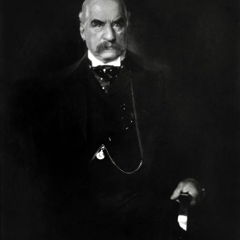
How shifting a monochrome scene into the bright or dark end of the tonal scale sets mood, and the metering and lighting each approach demands.
· 6 min read
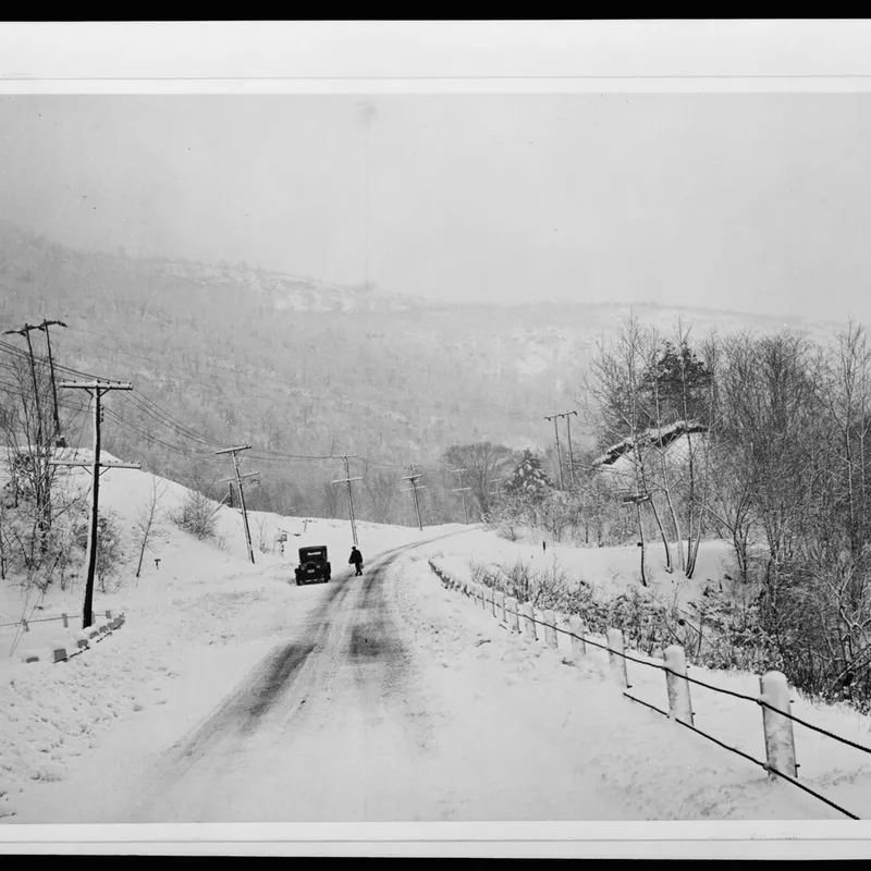
In monochrome a line is wherever light meets dark. How luminance edges, not colour boundaries, carry the eye through a black and white frame.
The grainmag companion app
Meter and place your tones without a signal. No account, no internet required — just you, the light, and the grain.