
· 5 min read
Acros II Reciprocity: Why Metered Exposure Holds Into Multi-Second Territory
How Fujifilm Neopan 100 Acros II resists reciprocity failure to 120 seconds, and what its Super Fine-Sigma grain delivers.
Written in by Simon Lehmann Editor
Look at a portrait from the 1880s or 1890s and the tonal signature is unmistakable: chalky pale skies, lips that read almost black, freckles and ruddy complexions exaggerated into blotches, blue eyes that turn luminous. This is not a quirk of age or printing. It is the spectral signature of orthochromatic film, an emulsion sensitive to blue and green but effectively blind to red. The earlier wet-collodion plates of the 1850s to 1870s were narrower still: they responded to ultraviolet and blue only, so they were not orthochromatic at all but blue-sensitive. Orthochromatic is the second step in a sequence that ends, around the 1920s, with panchromatic film seeing the full visible spectrum. Tracing that sequence explains the tonality of early photography and, through the same physics, how colour-contrast filters control black-and-white tone to this day.
A silver halide emulsion is not naturally sensitive across the visible spectrum. Untreated silver bromide and silver chloride respond to ultraviolet and blue light up to roughly 500 nm and have essentially no native response to green, yellow or red. A bare emulsion is therefore colour-blind in the extreme: it records a clear sky as near-white and anything red as near-black. Green foliage, orange brick and red lips all collapse towards the same dark, undifferentiated tone because the silver halide simply does not absorb those wavelengths.
This is a property of the grain itself. A photon below about 500 nm carries enough energy to be absorbed by the halide and free an electron, which is trapped to build the latent image. A photon of green or red light passes through without depositing that energy, so no exposure occurs no matter how bright the subject.
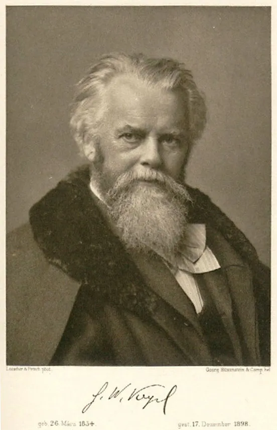
The breakthrough came in 1873, when the German chemist Hermann Wilhelm Vogel (1834-1898) found that adding small quantities of certain dyes, the early ones being corallin and aurin, extended an emulsion’s sensitivity beyond blue. J. M. Eder refined the approach in 1884 with erythrosin, a far more effective green sensitiser that became the standard.
The mechanism is the key, and it is the reason the trick works at all. A bare halide grain cannot absorb a green photon, but a sensitising-dye molecule adsorbed onto the grain surface can. The dye absorbs a photon at its own, longer wavelength and transfers that energy directly to the silver halide crystal, creating exactly the kind of latent-image site that a blue photon would have produced. The length of the dye’s conjugated carbon chain sets the wavelength it captures: a longer chain reaches further towards the red. The transfer is efficient, with a relative quantum yield approaching unity, so a dye-sensitised grain responds to green almost as readily as it responds natively to blue.
Plates sensitised this way became known as orthochromatic, from the Greek for “correct colour”, though the label was optimistic. An orthochromatic emulsion sees blue and green, peaks around 560 nm, then falls off sharply through the yellow-orange and dies away past roughly 590 to 600 nm. The practical range is about 400 to 600 nm, with little or no response to orange and red. The first commercial product followed quickly: Tailfer and Clayton were granted a patent in 1883, and B. J. Edwards and Co. marketed orthochromatic plates, sold as “Isochromatic”, from 1886.
Because the emulsion is over-responsive to blue and deaf to red, it maps colour onto grey in a predictable but distorted way. A clear blue sky exposes the film heavily and prints as a blank white field, which is why early landscapes so rarely show cloud detail. Red and orange subjects expose it scarcely at all and print dark. ILFORD’s technical data sheet for Ortho Plus, a current orthochromatic film originally designed as a high-resolution copy stock, puts it plainly: its lack of red sensitivity “can even give an unusual / desirable effect to images having red or orange hues (reds appear much darker than normal)”. The same sheet shows the spectral curve climbing from about 400 nm and falling away after roughly 600 nm with no useful red response. Rollei Ortho 25 plus, a second modern example rated at ISO 25, states its sensitivity as 380 to 610 nm, the same orthochromatic window expressed as a hard number.
On the human face this is unflattering. Lips darken towards black, sunburn and rosacea and freckles deepen and separate from the surrounding skin, while blue eyes lighten until they look blank. Silent cinema shows the effect at scale. Orthochromatic movie stock made red lipstick photograph black and blue eyes read pale and empty, so actors painted themselves with blue and yellow greasepaint and avoided red. Max Factor introduced his Flexible Greasepaint in 1914 specifically to sit correctly on ortho stock, and the whole convention only relaxed when panchromatic film arrived in the 1920s.
Red-blindness carries one genuine advantage in the darkroom: because the emulsion cannot record red, you can develop and inspect by sight under a deep red safelight instead of working blind. The Ortho Plus datasheet specifies either total darkness or an ILFORD 906 dark-red safelight with a 15-watt bulb, kept a minimum of 1.2 m / 4 ft from the bench to avoid fogging and the loss of contrast that fogging brings.
A concrete pass through the figures: rate Ortho Plus at ISO 80/20° in daylight, or ISO 40/17° under tungsten at 2850 K, which is the same as opening up one stop (135 cassettes are DX coded at 80, so set 40 by hand for tungsten). Develop in ID-11 stock at 20°C / 68°F with intermittent agitation: 8:00 gives a soft negative at G-bar 0.62, 10:00 a punchier 0.70, and anything in that 0.62 to 0.70 band is considered normal for in-camera use. ID-11 diluted 1+1 runs 10:30 to 13:00; Microphen stock 9:00 to 12:00; Perceptol stock 13:00 to 16:00; Ilfotec HC at 1+15 just 4:00 to 5:00. To pull a darkened sky back, the same sheet lists daylight filter factors of 2.5x for a 104 yellow and 5.5x for a 109 deep yellow.
Full panchromatic sensitisation, reaching to around 650 to 700 nm, was patented in 1902 by Adolf Miethe and Arthur Traube; Wratten and Wainwright in England made the first commercial panchromatic plates in 1906, a priority C. E. K. Mees later credited to them. Panchromatic stock gradually displaced orthochromatic for general work because it renders skin, lips and skies far closer to how the eye reads them, at the cost of having to develop in complete darkness.
“Sees like the eye” is only roughly true, and the caveat matters. A panchromatic emulsion remains more blue-sensitive than human vision, so an uncorrected sky still prints too light and clouds wash out. That residual blue bias is precisely why the yellow filter is the default landscape correction, and it is where the orthochromatic story rejoins modern practice. The lever that early plates applied through their emulsion chemistry now lives in colour-contrast filters fitted to panchromatic film. A yellow #8 / K2 costs about one stop and separates blue sky from cloud; an orange #21 costs about two stops and deepens the sky further; a red #25 costs about three stops and renders blue sky nearly black. Each filter darkens its complementary colour by holding it back from the film, which is the same selective deafness that orthochromatic emulsions had built in. The orthochromatic look never disappeared. It became a deliberate choice, and its red-darkening, sky-whitening character remains the clearest demonstration that an emulsion’s spectral sensitivity, not just its exposure, fixes the grey scale of a finished print.
Image: Hermann Wilhelm Vogel (1883), pioneer of orthochromatic dye-sensitized photography, public domain
· 5 min read
How Fujifilm Neopan 100 Acros II resists reciprocity failure to 120 seconds, and what its Super Fine-Sigma grain delivers.

· 6 min read
How inversion, twirl, and rotary agitation move developer across the emulsion, the patterns they leave, and how each shapes evenness and contrast.

· 6 min read
Why the blue filter exaggerates atmospheric haze and softens distance in black-and-white, and how it recreates the rendering of early orthochromatic emulsions.
The grainmag companion app
Meter and place your tones without a signal. No account, no internet required — just you, the light, and the grain.