· 8 min read
Architecture in Black & White: Reading Geometry Through Light and Shadow Edges
How shadow falloff on planar surfaces, hard graphic edges and the absence of colour make monochrome a natural language for architectural form.
Written in by Simon Lehmann Editor
Black-and-white film records colour as a single scale of grey, so a blue sky and a sunlit sandstone wall can fall on nearly the same tone even though the eye reads them as plainly different. Contrast filters resolve this by selectively absorbing parts of the spectrum before the light reaches the emulsion. The orange filter occupies the practical centre of that range: stronger than yellow, more controlled than red, and well matched to the problems of distant landscape and built form.
A contrast filter for panchromatic work transmits its own colour and attenuates the complementary ones. The standard orange is the Kodak Wratten 21, a longpass filter that passes freely through red with its half-height (50% transmission) cutoff at approximately 530 nm; it blocks essentially everything shorter. Set it against its neighbours and the family becomes clear: Wratten 8 (yellow) cuts near 465 nm, the deep yellows 12 and 15 at roughly 500 and 510 nm, the deep orange Wratten 22 at about 550 nm, the red Wratten 25 at 580 nm, and the deep red Wratten 29 at around 600 nm. Orange therefore removes all blue and a meaningful share of green while leaving the warm end intact, sitting squarely between the gentle correction of yellow and the dramatic rendering of the 25 and 29.
How that cutoff translates into tone depends on the film. Orange lightens warm-reflecting subjects and darkens blue-skylit ones, but the magnitude is set by each emulsion’s spectral sensitisation: a modern tabular-grain film such as Ilford Delta 100 carries its blue and red response differently from an older cubic-grain stock like Kodak Tri-X, so the same Wratten 21 yields a slightly different sky-to-stone separation on each. Treat the filter’s published cutoff as fixed and the resulting contrast as film-dependent.
Absorption carries an exposure cost, and this is where manufacturers’ tables mislead. The rule is exact: required compensation in stops equals the base-2 logarithm of the filter factor. A factor of 2 is one stop, a factor of 4 is two stops, a factor of 8 is three. So when Ilford lists the orange filter at factor 4 but recommends opening up by one stop in practice, the table is internally inconsistent: factor 4 should mean two stops.
The discrepancy is real and worth understanding rather than papering over. Published filter factors are average-daylight figures derived from a particular reference spectrum; many references list the Wratten 21 at factor 2, or one stop, reflecting that average. The light you actually meter, the film’s own sensitisation, and the colour temperature of the day all move the true figure. The resolution is to follow the film maker’s stated daylight value rather than a generic chart. Through-the-lens metering reads the light after the filter, but Ilford warns that most TTL meters will not correctly compensate for a strong orange filter, since the meter’s spectral response does not match the film’s; treat a TTL reading as a starting point, not a guarantee. If you meter externally with no film-specific guidance, treat the Wratten 21 as one to two stops and bracket the first time you use it on a given emulsion.
Distance haze is largely a blue phenomenon. Rayleigh scattering, described by Lord Rayleigh (John William Strutt) in 1871, is inversely proportional to the fourth power of wavelength. Halving the wavelength multiplies scattering by 2⁴, sixteen times, but that octave runs from 450 nm blue to 900 nm near-infrared and overstates the visible case. Within the visible band, blue at about 450 nm scatters roughly (700/450)⁴, nearly six times, more strongly than red at 700 nm. That scattered blue veils distant subjects and compresses far tones toward a flat grey.
The mechanism makes the filter ranking quantitative rather than a matter of assertion. Yellow (8) removes wavelengths shorter than about 465 nm and so cuts only the most strongly scattered violet-blue; orange (21) removes everything below 530 nm, taking out the entire blue band where Rayleigh scattering is most intense; red (25) extends the cut to 580 nm, removing blue-green as well. Because the scattering curve falls steeply with wavelength, the jump from yellow’s 465 nm to orange’s 530 nm captures most of the worst-scattered light, which is why orange clears clean blue haze far better than yellow yet trails only slightly behind red, all without red’s heavy darkening elsewhere in the frame.
The filter only works on haze that is genuinely blue. Fog, mist, low cloud, and urban smog scatter by the Mie mechanism, where the water droplets and aerosols are comparable to or larger than the wavelength of light. Mie scattering is essentially wavelength-independent: it whitens every colour roughly equally, so there is no blue excess for an orange filter to subtract. No contrast filter cuts true fog or pollution the way it cuts clean, high-altitude blue haze. If the distance is veiled grey-white rather than veiled blue, the orange filter will darken your sky and do nothing for the murk.
For the built environment the orange filter is valuable precisely because masonry is warm. Consider the material pairing the filter is made for: warm red brick or sandstone against a cool grey slate roof. The brick reflects strongly in the orange and red the filter passes, so it lightens and its surface texture lifts; the slate, carrying a cool bluish cast, is held back and darkens. Two materials that merge into one mid-grey on an unfiltered frame separate cleanly. Weathered limestone and oxidised copper, both cool, fall the same way as the slate, widening the gap further.
A worked example fixes the magnitudes. The canonical source here is Ansel Adams, who in The Negative (1981) treats filters as a Zone System tool, using blue-blocking filters to place sky tone on a chosen lower zone. Working on Ilford FP4+ at EI 125, meter a sunlit limestone facade and place it on Zone VI: say f/11 at 1/250 unfiltered. A clear blue sky reading two stops down already sits near Zone IV. Fit the Wratten 21 and open up to compensate the filter factor, recomposing the limestone back to Zone VI. The sky, lit by the scattered blue the filter rejects, does not recover with that compensation: it drops a further one and a half to two zones, settling on a firm Zone II to III. The limestone holds its luminous Zone VI while the sky goes a deep, even grey, and a slate roof in the same scene falls between them rather than collapsing into the sky.
That raised negative contrast meets the print at the grade you choose. Because the orange filter has already widened the negative’s tonal range, you can often drop a paper grade on multigrade material and still hold both the lit stone and the deepened sky, rather than fighting a flat negative up at grade 4. The filter does part of the contrast work in camera that you would otherwise ask of development time and paper grade. Orange thus offers the architectural photographer a controlled rise in contrast: enough to assert form and material, restrained enough to keep the sky credible rather than driving it to the near-black of a deep red.
Sources: Ilford Photo, “Using colour filters for black and white photography”; the Kodak Photographic Filters Handbook (Publication B-3); and Ansel Adams, The Negative (1981).
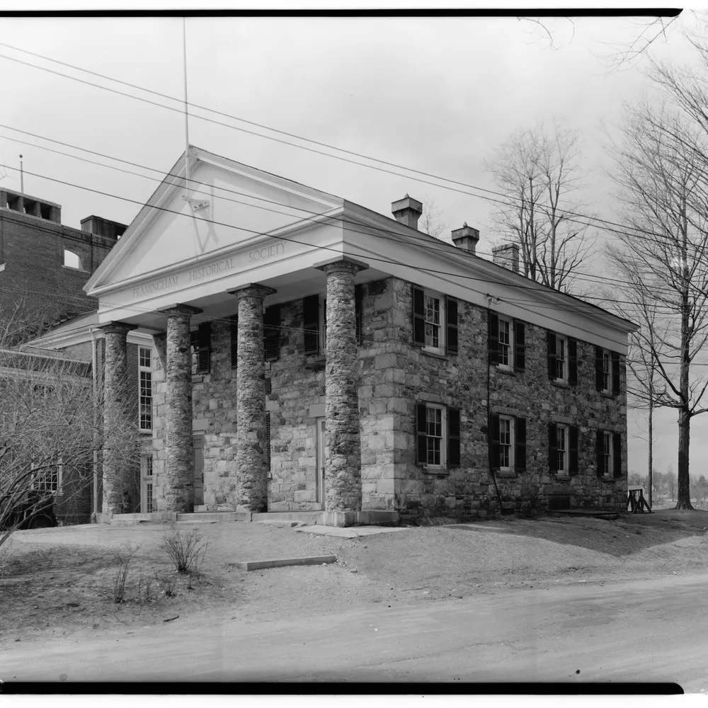
Image: Historic American Buildings Survey, Framingham Academy, Framingham, Massachusetts (1934), U.S. Library of Congress, public domain
· 8 min read
How shadow falloff on planar surfaces, hard graphic edges and the absence of colour make monochrome a natural language for architectural form.

· 6 min read
How Bill Brandt traded tonal fidelity for stark blacks, bleached whites, and the steep distortion of a wide-angle police camera.
· 6 min read
Why the blue filter exaggerates atmospheric haze and softens distance in black-and-white, and how it recreates the rendering of early orthochromatic emulsions.
The grainmag companion app
Meter and place your tones without a signal. No account, no internet required — just you, the light, and the grain.