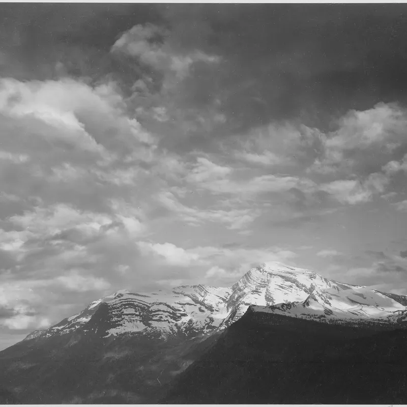
· 6 min read
The Negative as Score: Adams, Print Values, and the Logic of Dodging and Burning
How Ansel Adams treated the negative as a fixed score and the print as performance, holding back and burning in to realize a visualized tonal scale.
Written in by Simon Lehmann Editor
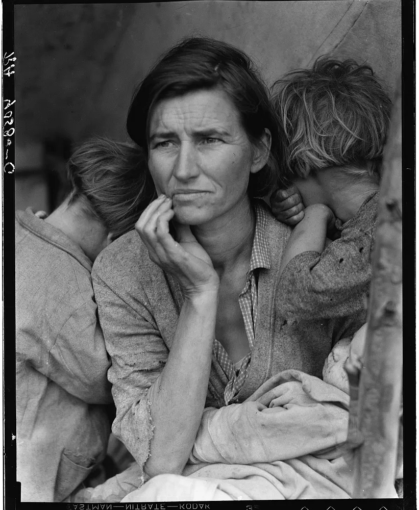
A documentary photograph persuades through descriptive separation, not through drama in the printing. In the work Dorothea Lange made for the Resettlement and Farm Security Administration, the tonal scale is held toward the middle and the camera is brought close. The famous Nipomo frame of March 1936 shows both decisions at work, and both can be stated in numbers rather than left as a feeling.
Lange’s published technical data for the frame are specific: a 4x5-inch Graflex (the Series D single-lens reflex), a Zeiss Tessar 7.5-inch (190mm) lens, the aperture at f/8, the shutter at 1/15 second, on super-sensitive panchromatic sheet film she recorded as “S.S. Pan.” Period super-sensitive pan sheet ran around Weston 50 / GE 125, roughly EI 80 by modern reckoning, and was developed in fine-grain borax soups such as Agfa-Ansco 17, functionally the ancestor of Kodak D-76.
Those settings explain the picture. At f/8 with a 190mm lens focused a few feet away, depth of field is shallow, which separates the family from the lean-to behind them. And 1/15 second handheld is slow enough that the stillness in the frame is not incidental; it is the stillness of a sitter who has, in effect, posed. The camera did not lend itself to snatched frames, and the result reads as a held moment rather than a grabbed one.
The large negative is also why proximity worked. Printed to 16x20 inches, a 4x5 negative needs only about 4x linear enlargement; a 35mm frame to the same size needs roughly 13-14x. At 4x the grain stays invisible and skin texture, fabric weave and the dirt of a camp survive into the print. A small-format frame moved this close would have surrendered exactly the descriptive detail the record depended on.
Read the tones as a luminance range. In open shade at a tent the scene spans roughly five stops, Zone III to Zone VII. Place the careworn face on Zone V to VI, where average skin sits one stop above the 18% middle grey that every reflected-light meter is calibrated to. The shadow under the hat brim then falls on Zone III, dark but textured rather than blocked; the brightest patch of cloth lands near Zone VII, bright but still holding detail. Each zone is one stop, a factor of two in exposure, so the whole face-and-fabric story occupies a narrow, continuous band of greys with nothing crushed to paper-white or featureless black.
That zone reading is a retrospective lens, not Lange’s method. The Zone System was formalised by Ansel Adams and Fred Archer around 1939-40 at the Art Center School in Los Angeles, after the 1936 negative. Lange metered fast with a Weston and worked on assignment; zones are how we can analyse what she achieved, not how she described doing it.
The mechanism lives in the paper’s characteristic curve. The straight central section carries the most tonal separation; the toe compresses highlights toward white and the shoulder compresses shadows toward black, both with little detail. A flat, low-density-range negative needs a higher-contrast grade to restore separation, and there is a limit. Print such a negative on grade 2 and the mid-tones may look soft; move to grade 3 for a steeper curve and the lower mid-tones gain bite. Push further still and the face’s values slide onto the toe and shoulder: skin goes chalky, eye-sockets and hat-shadow plug up, and the subject abstracts into graphic shape. That is the opposite of what a survey record requires, which is why mid-tone-led printing is structural to this work, not a stylistic preference.
To reproduce the principle today, meter the face and place it on Zone VI by opening one stop over the reading; let the shadows fall on Zone III. Shoot a five-stop scene on Ilford HP5 Plus at EI 400, or FP4 Plus at EI 125, develop in ID-11 or D-76 at 1+1, 20C, for the manufacturer’s stated time, and print on grade 3 to pull the mid-tones apart. The historical idea maps directly onto current materials.
Lange’s own account in Popular Photography (February 1960) reads: “I saw and approached the hungry and desperate mother, as if drawn by a magnet. I made five exposures, working closer and closer from the same direction. I did not ask her name or her history.” She added that the mother said she was thirty-two, had been living on frozen vegetables and birds the children killed, and had just sold the tyres off her car to buy food.
The number is not settled. Lange recalled five; the Library of Congress FSA-OWI collection holds six negatives from the Nipomo session, and some accounts cite a seventh. The original FSA caption read “Destitute pea pickers in California. Mother of seven children. Age thirty-two. Nipomo, California.” Each step inward strips away context until only the family fills the frame, and that tightening is the documentary argument: proximity forecloses the comfort of looking at poverty from across a field.
It also withheld something. The subject went unnamed for forty years, identified only in 1978 as Florence Owens Thompson, of Cherokee descent, then about 75, who said she had never been paid despite the image’s worldwide circulation. An argument about collapsing the distance between viewer and subject has to sit with the fact that the subject herself was anonymised for four decades. The one documented manipulation in the FSA file points the same way: on the final negative the thumb gripping the lean-to post at the lower-right edge was retouched out, a faint trace surviving in some prints. Stryker’s documentary doctrine ran against such interventions, which is exactly why the single edited thumb is conspicuous against the restraint everywhere else.
The choice was a program, not only an aesthetic. The FSA-OWI photographic project ran from 1935 to 1944, directed for most of its life by Roy E. Stryker, and the file is overwhelmingly black-and-white: the largest body of negatives is 35mm, with substantial 4x5, 3.25x4.25 and some 5x7 and 8x10 material from Lange, Walker Evans, Russell Lee, Arthur Rothstein, Ben Shahn, Jack Delano, Marion Post Wolcott, Gordon Parks, John Vachon and Carl Mydans. Monochrome was cheaper and faster, and it reproduced cleanly as a halftone in the newspapers and magazines where the work had to land. Panchromatic film rendered weathered skin and overcast sky across a full grey scale, so stripped of hue the attention falls on tone, gesture and structure: the set of a mouth, the position of a hand, the fall of light across a face. That register is what a government survey of rural distress required.
Image: Dorothea Lange, “Migrant Mother” (Destitute pea pickers, Nipomo, California), 1936. U.S. Farm Security Administration / Library of Congress.
· 6 min read
How Ansel Adams treated the negative as a fixed score and the print as performance, holding back and burning in to realize a visualized tonal scale.
· 6 min read
How Bill Brandt traded tonal fidelity for stark blacks, bleached whites, and the steep distortion of a wide-angle police camera.
· 8 min read
How Cartier-Bresson fused timing with internal geometry, composing the full 35mm frame in the viewfinder and printing uncropped, with the Leica as a discreet tool.
The grainmag companion app
Meter and place your tones without a signal. No account, no internet required — just you, the light, and the grain.